

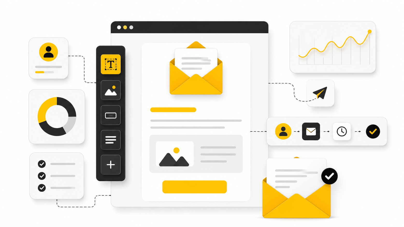
Email marketing design is not decoration. It is the system that helps a subscriber understand what matters, trust the message, and take the next step without friction.
That matters because email is still one of the few channels where the business owns the relationship. Recent Litmus research found that many companies see email ROI in the range of $10 to $36 for every $1 spent, but that return does not come from pretty templates alone. It comes from clarity, structure, timing, accessibility, and consistent execution.
This article breaks the topic into six practical parts:
- Why Email Marketing Design Matters
- The Email Design Framework
- Core Components of High-Converting Emails
- Mobile, Accessibility, and Dark Mode
- Professional Implementation and Testing
- Tools, Workflow, and FAQ
Why Email Marketing Design Matters
Good email marketing design reduces the amount of thinking a reader has to do. The subject line earns the open, but the design decides whether the message feels useful, credible, and worth clicking. A strong layout makes the offer obvious, supports the copy, and removes visual noise.
This is especially important because inboxes are fragmented across devices, apps, and display settings. Litmus notes that email client usage changes constantly and recommends tracking your own audience rather than designing from assumptions through its email client market share research. In plain English: your email has to survive real inbox conditions, not just look good in the builder.
Design also affects trust. If spacing is sloppy, buttons are unclear, images break, or the email looks bad in dark mode, the reader feels that friction immediately. Modern email marketing design has to make the brand feel sharp before the reader consciously evaluates the offer.
The Email Design Framework
The simplest useful framework is this: message first, hierarchy second, visuals third, testing always. Start with the one action the email needs to drive. Then build the design around helping the reader reach that action naturally.
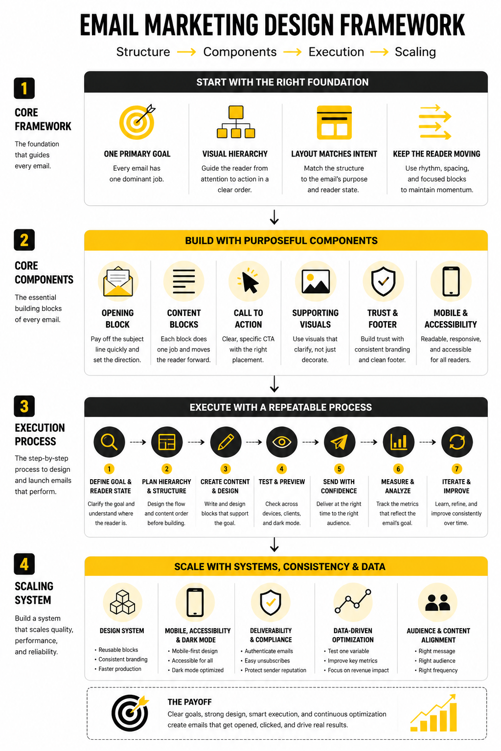
A practical email design framework has four layers:
- Purpose: what the email is trying to achieve
- Hierarchy: what the reader should notice first, second, and third
- Interaction: what the reader should click, tap, reply to, or remember
- Reliability: whether the email renders properly across inboxes, devices, and modes
This is where many teams get it backwards. They start with a template, fill boxes with copy, and hope the result converts. A better approach is to choose the structure after the intent is clear, whether that means a simple newsletter, a product launch email, a lifecycle sequence, or a sales-driven campaign built inside a platform like Brevo or Moosend.
Core Components of High-Converting Emails
Every strong email has a visible path. The reader should understand the promise near the top, get enough proof or context to care, and see a call to action that feels like the obvious next step. That path is more important than adding more sections.
The core components are:
- A clear preheader that supports the subject line
- A strong opening block with one main idea
- A readable content structure with short sections
- A primary CTA that is easy to find
- Supporting visuals that clarify, not distract
- Footer details that build trust and meet compliance expectations
The best email marketing design does not try to impress designers. It helps busy people make a decision quickly. That is the standard the rest of this article will use.
The Email Design Framework
The job of email marketing design is to create a clear path from attention to action. That path should feel obvious, not forced. If the reader has to decode the layout before they understand the message, the design is already working against you.
A good framework starts before the email builder opens. First, define the business goal. Then define the reader’s current state. Only after that should you choose the layout, visuals, CTA placement, and supporting content.
Start With One Primary Goal
Every email needs one dominant job. It might be getting a click, booking a call, completing a purchase, reading an update, or returning to a cart. The mistake is trying to make one email do five jobs at once.
This is where design discipline matters. If the goal is a product click, the headline, body copy, product block, and button should all support that click. If the goal is education, the structure should make the lesson easy to scan and remember before asking for anything.
For teams building full funnels, tools like ClickFunnels or GoHighLevel can help connect the email to the next step. But the tool will not fix a confused message. The email still needs one clear reason to exist.
Build the Visual Hierarchy Before the Template
Visual hierarchy decides what the reader sees first, what they understand next, and what they do after that. This is not about making everything bigger or louder. It is about making the most important idea impossible to miss.
A strong hierarchy usually follows this order:
- Sender recognition
- Subject line and preheader promise
- Hero message or opening statement
- Supporting context
- Primary CTA
- Secondary details
- Footer and compliance information
The key is contrast. Headlines need enough weight to stand apart from body text. Buttons need enough space to feel clickable. Supporting sections need clear separation so the email feels structured instead of dumped into the inbox.
Match the Layout to the Intent
Different emails need different structures. A newsletter needs scannable sections. A launch email needs momentum. A transactional email needs speed, accuracy, and trust. A nurture email needs rhythm, because the reader may not be ready to act yet.
This is why copying a beautiful template can still fail. The template may look polished, but if it does not match the intent of the message, it creates friction. Good email marketing design is not “make it pretty.” It is “make the next action feel natural.”
For ecommerce or landing-page-heavy campaigns, a builder like Replo can help keep the post-click experience aligned with the email. That alignment matters because the click is not the finish line. It is the handoff.
Keep the Reader Moving
A well-designed email has rhythm. It gives the reader enough information to stay interested, then moves them forward before attention fades. Long blocks of text, weak section breaks, and buried buttons slow that rhythm down.
The simplest fix is to design in blocks. Each block should answer one question, remove one doubt, or move the reader closer to the CTA. If a block does none of those things, cut it.
This is especially important for mobile readers. Short paragraphs, clear buttons, and strong spacing are not cosmetic choices. They are usability choices. In email, usability is conversion design.
Core Components of High-Converting Emails
Once the framework is clear, implementation becomes much easier. You are no longer guessing where things should go. You are building each email from the same reliable parts, then adjusting the details based on the campaign goal.
The point is not to make every email look identical. The point is to make every email feel intentionally designed. That is how email marketing design becomes a repeatable asset instead of a random creative task.
The Opening Block
The opening block has to pay off the subject line quickly. A reader should understand the promise of the email within the first few seconds. If the headline is vague, the image is decorative, and the first paragraph takes too long to get moving, the email loses momentum before the CTA has a chance.
A strong opening block usually includes a clear headline, a short supporting line, and one obvious direction. It does not need to explain everything. It needs to make the reader want the next section.
This is where restraint matters. One strong idea beats three competing ideas every time. If the email is about a product update, lead with the outcome. If it is about an offer, lead with the reason to care. If it is about education, lead with the problem the reader already recognizes.
The Content Blocks
Content blocks turn the email into a sequence. Each block should do one job, such as explaining a benefit, answering an objection, showing a feature, or guiding the reader toward a decision. When blocks are too similar, the email feels padded. When they are too different, the email feels scattered.
A practical content block includes:
- A short section heading
- One focused idea
- Supporting copy that earns its space
- A visual or link only when it helps comprehension
- A natural transition into the next block
This process keeps the design clean because every element has a reason to exist. It also makes editing easier. If a section does not support the primary goal, it gets cut or moved into a different email.
The Call to Action
The CTA is not just a button. It is the point where the reader decides whether the email was worth their attention. That means the button text, placement, contrast, and surrounding copy all need to work together.
A good CTA is specific enough to reduce uncertainty. “Get started” can work when the context is obvious, but “Build your first campaign” or “See the offer” often gives the reader more confidence. The best CTA feels like the next logical step, not a sudden sales pitch.
Placement matters too. The first CTA should appear after the reader has enough context to act. In shorter emails, that may be near the top. In longer emails, repeat the CTA only when a new section creates a fresh reason to click.
The Supporting Visuals
Visuals should make the message easier to understand. They can show the product, simplify a workflow, create emotional context, or break up dense copy. They should not exist just because the template has an image slot.
This is where many email designs become weaker than they need to be. A large hero image can look polished, but if it pushes the real message below the fold or fails to load cleanly, it becomes a liability. The copy and CTA must still work if the image does not.
For product-led campaigns, landing page consistency also matters. If the email visual promises one experience and the click leads somewhere visually disconnected, trust drops. Builders like Replo can help ecommerce teams keep campaign pages aligned with the email, while platforms like ClickFunnels can support more direct offer-driven flows.
The Footer and Trust Elements
The footer is not glamorous, but it matters. It gives the reader context, compliance details, brand information, and a way to manage their subscription. A sloppy footer can make even a strong email feel careless.
Keep the footer clean and predictable. Include the required company details, unsubscribe access, preference options when available, and any necessary legal language. Do not turn the footer into a junk drawer full of unrelated links.
Trust also comes from consistency. The sender name, branding, tone, and design system should feel familiar across campaigns. When subscribers recognize the brand quickly, the email has less work to do before the message can land.
Statistics and Data
Email data is useful only when it changes what you do next. Open rates, click rates, conversions, unsubscribes, spam complaints, and revenue per recipient all tell a different part of the story. The mistake is treating them like a scoreboard instead of a diagnostic system.
This matters because email marketing design can improve performance in more than one place. A clearer layout can increase clicks. Better spacing can improve mobile engagement. Stronger CTA placement can improve revenue without changing the offer at all.
Benchmarks Are Context, Not Targets
Benchmarks help you understand whether your performance is unusually low, unusually high, or roughly normal for your category. They should not become the goal by themselves. A campaign with a lower open rate can still make more money if the audience is better qualified and the CTA is stronger.
Recent benchmark data shows how wide the range can be. MailerLite’s 2026 benchmark dataset shows ecommerce at a 32.67% average open rate while nonprofits sit above 52%, which proves why generic averages can mislead you. The right question is not “Are we above average?” The right question is “Are we improving against our own baseline with the same audience type?”
For email marketing design, this means you should compare like with like. Promotional emails should be compared with other promotional emails. Newsletters should be compared with newsletters. Automated lifecycle emails should be measured separately because their audience intent is usually much stronger.
The Metrics That Actually Matter
Open rate is a weak design metric on its own. Privacy changes, inbox behavior, and image loading can distort it, so it should be treated as a directional signal rather than proof. It can still help you judge sender recognition and subject-line relevance, but it does not tell you whether the design worked.
Click-through rate is more useful because it shows whether the email created enough interest to drive action. Click-to-open rate can help isolate what happened after the open, especially when you are testing layout, CTA position, offer framing, or content order. Conversion rate and revenue per recipient are the strongest signals when the email has a commercial goal.
A clean measurement stack should track:
- Open rate for subject line and sender health
- Click-through rate for message and layout strength
- Click-to-open rate for post-open engagement
- Conversion rate for offer and landing page alignment
- Revenue per recipient for campaign quality
- Unsubscribe rate for audience fit and frequency pressure
- Spam complaint rate for trust and deliverability risk
What Performance Signals Tell You
If opens are healthy but clicks are weak, the issue is usually inside the email. The promise got attention, but the design, copy, CTA, or offer did not carry that attention forward. In that case, changing the subject line is the wrong fix.
If clicks are healthy but conversions are weak, the problem may be after the click. The landing page might not match the email, the offer might need more proof, or the page experience may be too slow or confusing. This is where connecting email design to funnel design becomes important, especially when using tools like ClickFunnels or GoHighLevel.
If unsubscribes rise after a design change, do not panic immediately. Sometimes a sharper email repels the wrong audience while improving buyer intent. But if unsubscribes rise while clicks and revenue fall, the campaign is probably creating friction, overpromising, or pushing too hard.
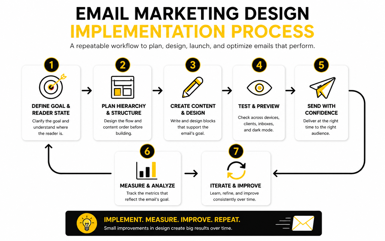
How to Turn Data Into Better Design
The best way to improve email marketing design is to test one meaningful variable at a time. Do not change the headline, layout, button color, offer, image, and send time in one test, then pretend you learned something. You did not. You created noise.
Start with the parts closest to the action. Test CTA wording, CTA placement, opening block clarity, section order, and mobile spacing. These changes are practical, fast to implement, and directly connected to reader behavior.
A simple improvement loop works well:
- Choose one campaign type.
- Record the current baseline.
- Identify the weakest metric.
- Connect that metric to a likely design issue.
- Test one design change.
- Review the result against the original baseline.
- Keep the winner and repeat.
Do Not Chase Pretty Reports
A beautiful dashboard can still hide bad thinking. The goal is not to collect more metrics. The goal is to make better decisions faster.
For most teams, a small set of consistent performance signals is enough. Track what each email was meant to do, how the design supported that goal, and where readers dropped off. That gives you a practical design feedback loop instead of a pile of numbers.
This is where email marketing design becomes measurable. You are no longer debating opinions like “I like this template better.” You are asking a sharper question: did this design help the right reader take the right action?
Mobile, Accessibility, and Dark Mode
Advanced email marketing design is where the uncomfortable tradeoffs start. A design can look beautiful in the editor and still fail in real inboxes. It can also perform well for one audience segment while creating problems for another.
That is why the next level is not adding more design. It is removing fragility. The email needs to hold up across screen sizes, email clients, accessibility needs, dark mode settings, and deliverability rules.
Design for the Smallest Screen First
Mobile-first design forces discipline. It makes weak hierarchy obvious because there is nowhere for clutter to hide. If the headline, CTA, and main message do not work on a small screen, they are not clear enough yet.
A strong mobile email uses short sections, generous spacing, large tap targets, and a layout that does not depend on tiny side-by-side content. One-column structures are usually safer because they reduce rendering issues and make the reading path easier. This does not mean every email has to be boring. It means the design has to respect the way people actually read.
The tradeof
Tools, Workflow, and FAQ
The final layer of email marketing design is the ecosystem around the email. Templates, analytics, automations, landing pages, forms, CRM data, and follow-up workflows all shape whether the campaign actually works. A strong email cannot carry a broken system forever.
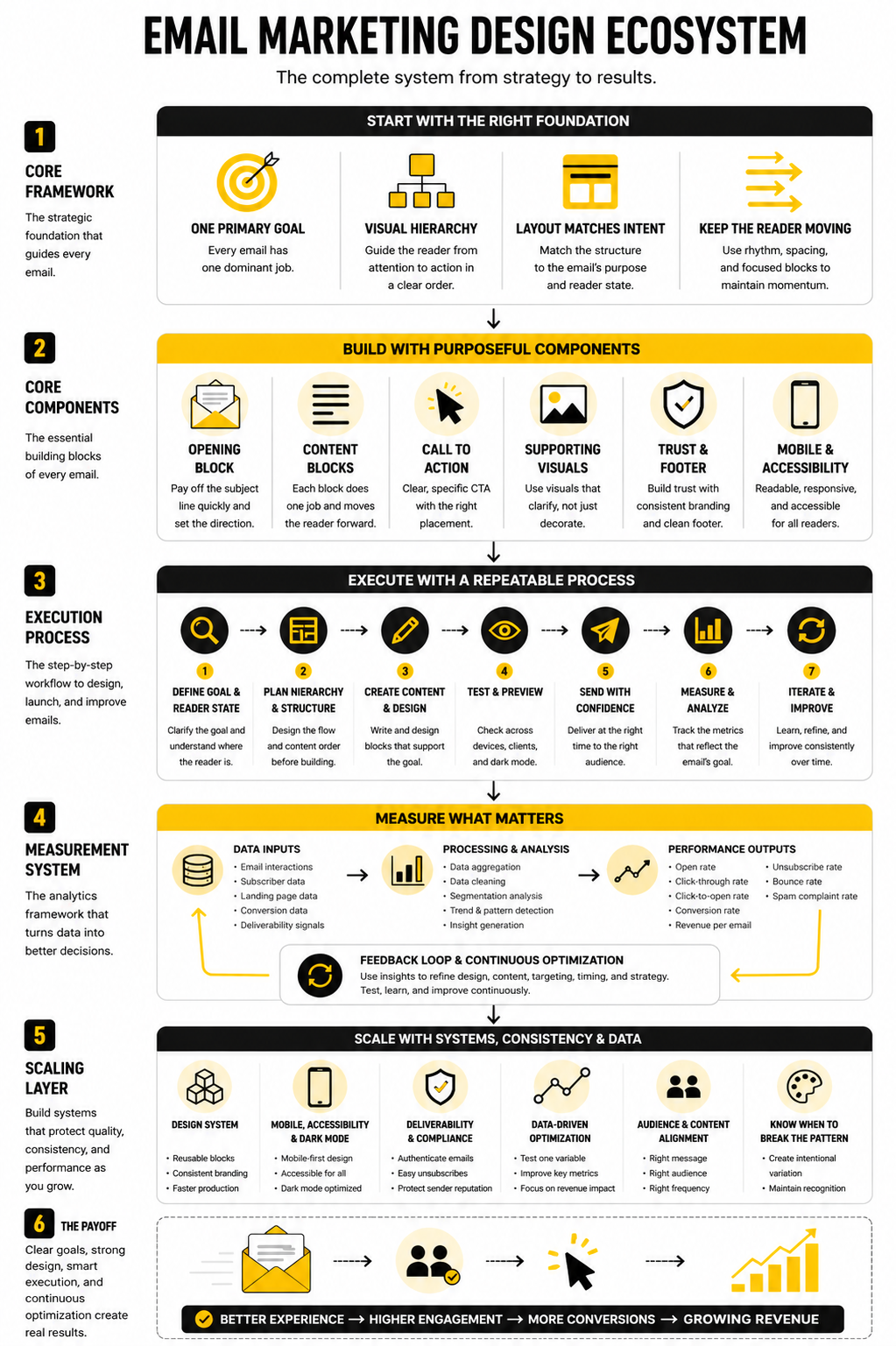
This is why the best teams think beyond the send button. They map the full path from subscriber data to message design, from click to landing page, and from conversion to follow-up. The email is one touchpoint, but the system decides how much value that touchpoint creates.
Choose Tools Around the Workflow
Do not choose an email platform just because the editor looks nice. Choose it based on how your team actually works. You need to know whether you are mainly sending newsletters, building automations, running ecommerce campaigns, managing leads, selling through funnels, or combining several of those jobs.
A platform like Brevo can make sense for teams that want email, CRM, automation, and multichannel messaging in one place. Moosend can fit teams that want straightforward campaign creation and automation without overcomplicating the stack. GoHighLevel is more useful when email sits inside a broader sales, CRM, booking, and pipeline workflow.
The main rule is simple. The tool should support your strategy, not become your strategy. If the list is messy, the offer is unclear, and the design system is inconsistent, switching platforms will not magically fix the problem.
FAQ - Built for Complete Guide
What is email marketing design?
Email marketing design is the structure, layout, visual system, and user experience of an email campaign. It includes typography, spacing, images, buttons, hierarchy, mobile responsiveness, accessibility, and how the email connects to the next step. Good design makes the message easier to understand and easier to act on.
Why does email marketing design matter?
It matters because subscribers decide quickly whether an email feels useful, trustworthy, and relevant. Design helps them scan the message, understand the offer, and find the next action without friction. If the layout creates confusion, even strong copy can underperform.
What makes an email design effective?
An effective email design has one clear goal, a strong opening, readable content blocks, obvious CTAs, and a clean path to the next step. It also works across mobile, desktop, dark mode, and different inboxes. The best designs feel simple because the hard thinking happened before the email was built.
Should emails be image-heavy or text-heavy?
It depends on the campaign, but the safest answer is balanced. Images can support product context and brand feeling, but the email should still make sense if images do not load. Critical messages, prices, CTA text, and important details should not live only inside images.
How many CTAs should an email have?
Most emails should have one primary CTA. Longer emails can repeat that same CTA when the reader reaches a new decision point. Multiple competing CTAs usually weaken the campaign because they make the reader choose between paths instead of taking the obvious next step.
What is the best layout for mobile email design?
A single-column layout is usually the most reliable mobile structure. It keeps the reading path clear, reduces rendering issues, and makes buttons easier to tap. Mobile-first email marketing design also forces better prioritization because every section has to earn its space.
How should I measure email design performance?
Start with the goal of the email, then choose the metric that reflects that goal. Click-through rate, click-to-open rate, conversion rate, revenue per recipient, unsubscribe rate, and spam complaints all reveal different problems. Do not judge design only by open rate because opens are affected by factors outside the email body.
How often should I redesign my email templates?
You should improve your templates continuously, but full redesigns should happen only when there is a clear reason. If the design is hard to maintain, performs poorly on mobile, fails in dark mode, or no longer matches the brand, redesign it. Otherwise, optimize blocks, CTAs, spacing, and structure based on performance data.
What is the biggest mistake in email marketing design?
The biggest mistake is designing before clarifying the message. Teams often start with a template, then force the campaign into it. Better design starts with the goal, the reader’s context, and the one action the email should drive.
Does dark mode really matter for email design?
Yes, because many subscribers use dark mode and email clients handle it differently. Some clients invert colors, some partially adjust them, and some leave designs unchanged. Testing dark mode helps protect readability, brand consistency, and CTA visibility.
How do accessibility rules affect email design?
Accessibility pushes you toward clearer design. Readable type, good contrast, logical structure, descriptive links, and useful alt text help more people understand the email. These choices also improve the experience for busy readers who are scanning quickly.
What tools are best for email marketing design?
The best tool depends on your workflow. Brevo and Moosend are practical options for campaigns and automations, while GoHighLevel can fit teams that need CRM and funnel workflows around the email. The real win comes from matching the tool to your process instead of chasing features.
Work With Professionals
Explore 10K+ Remote Marketing Contracts on MarkeWork.com
Most marketers spend too much time chasing clients, competing on crowded platforms, and losing a percentage of every project to middlemen.
MarkeWork gives you a better way. Browse thousands of remote marketing contracts and connect directly with companies desperate to hire skilled marketers like you, without platform commissions and without unnecessary gatekeepers.
If you're serious about finding better opportunities and keeping 100% of what you earn, explore available contracts and create a profile for free at MarkeWork.com.