

Most teams do not need another pretty email comp. They need a mockup that can survive the inbox it is actually going to land in. That means thinking beyond the hero block and looking at the whole experience, including the preheader people see beside the subject line, the way Gmail supports responsive behavior across screens, and the stubborn rendering differences that still show up in Outlook. Mailchimp+2
A good email marketing mockup is where strategy becomes visible before the expensive part starts. It is the stage where the team decides whether the inbox promise, the body layout, the CTA hierarchy, the live text, and the fallback behavior all work together instead of fighting each other. That is also why the mockup is not a side task inside the workflow; it is the place where you prevent a lot of avoidable redesign, QA churn, and approval drama. Litmus+2
If the email also has to match the rest of the funnel, keep the visual system aligned across the stack from day one. In practice, that often means designing the mockup so it feels consistent with the landing page in Replo, the nurture flow in HighLevel, the send environment in Brevo or Moosend, and the opt-in path in ClickFunnels or Systeme.io. The mockup should preview the real customer journey, not just the middle of one email.

- Why Email Marketing Mockups Matter
- The Email Marketing Mockup Framework
- Core Components of a High-Converting Email Mockup
- Designing for Mobile, Dark Mode, and Accessibility
- From Mockup to Production-Ready Email
- Testing, Approval, and Launch Without Surprises
Why Email Marketing Mockups Matter
The first reason is simple: subscribers judge the email before they read the email. The sender name, subject line, and preheader create the first impression, and Mailchimp treats that preview layer as a critical part of the message rather than an afterthought. If the mockup does not account for that top-line promise, the design can look polished in the body and still underperform where the decision to open actually happens. Mailchimp+1
The second reason is that email is not one environment. Google’s own guidance on responsive email points out that people read messages across computers, phones, and tablets, while Litmus shows that Outlook still brings a different rendering model and a different set of layout headaches than webkit-based clients. So when you mock up an email, you are not only arranging content; you are pressure-testing spacing, image behavior, stacking, and fallback choices before production starts. Google Cloud+1
The third reason is performance. Mailchimp’s email design guidance connects polished layout with clicks and conversions, Salesforce defines CTR as the share of delivered emails that earn clicks, and Campaign Monitor ties click rate to things like link placement, CTA choices, and content structure. In plain English, the mockup matters because it decides whether the next action is obvious or buried. Mailchimp+2
There is also a workflow reason that a lot of teams learn the hard way. Litmus frames email production as a system of planning, production, testing, and analysis, and its checklist exists for one reason: too many mistakes are easier to catch before send than after send. A strong mockup gives everyone one target, which makes approvals cleaner and keeps the later QA phase from turning into a second design round. Litmus+1
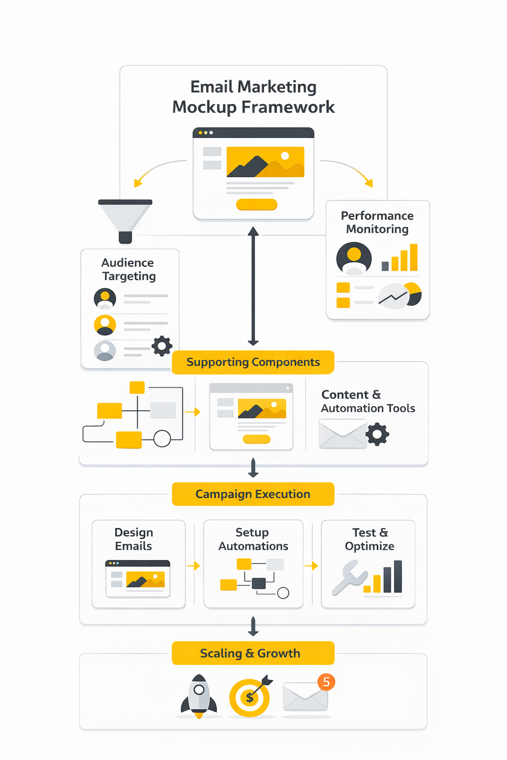
The Email Marketing Mockup Framework
The framework I use is practical, not fancy. A mockup should clear five checks before it moves forward: inbox promise, message hierarchy, modular structure, readability and access, and production handoff. If one of those pieces is weak, the final email usually feels weaker than the design review made it look.
- Inbox promise. The from name, subject line, and preheader have to feel like one coherent setup for the body copy. That is not optional when the preheader is one of the first things people see in the inbox and when subject line plus preview text shape the first click decision. Mailchimp+1
- Message hierarchy. The mockup should show one primary path through the email: headline, support, proof, CTA. Klaviyo’s design guidance warns against stuffing emails with too many offers or CTAs, and Campaign Monitor treats clicks as a direct signal of how well link placement and content structure are working. Klaviyo+1
- Modular structure. Great mockups do not reinvent the whole email every time. Litmus defines modules as reusable content blocks, and Oracle describes modular architecture as a faster, more flexible way to build emails with a defined messaging hierarchy and branded elements already in place. Litmus+1
- Readability and access. The mockup should assume that some people will see Dark Mode, some will have image-loading issues, and some will rely on assistive technology. W3C’s accessibility guidance favors live text over images of text and sets minimum contrast expectations, while Section 508 and Litmus both stress meaningful alt text so the message still works when images do not. Litmus also notes that over 40% of subscribers view emails in Dark Mode, which is more than enough to make Dark Mode part of the design phase instead of a late-stage patch. W3C+5
- Production handoff. A mockup is only useful if the next person can build from it without guessing. That means calling out module order, mobile stacking behavior, image intent, link targets, personalization zones, and any fallback logic before the HTML work begins. Litmus and Oracle both push the same direction here: reusable systems, clearer standards, and fewer last-minute fixes. Litmus+2
Notice what this framework removes. It cuts decorative decisions that do not help comprehension, and it exposes weak ideas before the team codes them into a campaign. That is the real job of an email marketing mockup: give copywriters, designers, marketers, and developers one sharp target before deadlines get tight. Litmus+1
Core Components of a High-Converting Email Mockup
A strong email marketing mockup is not one big design. It is a stack of smaller decisions that either make the message easier to act on or quietly make it harder. When teams miss this, they spend hours polishing color and spacing while the real problems sit in the inbox preview, the CTA wording, the reading order, or the footer experience. Litmus+2
The easiest way to judge a mockup is to ask a blunt question: if this landed in a crowded inbox right now, would the subscriber understand the offer, trust the sender, and know what to do next within seconds. That standard forces the design to work as a conversion tool instead of a decorative asset. It also makes reviews faster, because each component has a job and weak components become obvious very quickly. Mailchimp+1
Start With the Inbox Strip
The first component is not the hero image. It is the sender name, the subject line, and the preview text shown in the inbox. Litmus notes that preview text is widely supported across major email clients, and those clients may pull it from the first lines of copy, from ALT text, or occasionally from code if you leave the preview unmanaged. Litmus
That is why your email marketing mockup should always show the inbox strip together with the body, not as a separate afterthought. If the subject promises urgency but the preview text is generic, or if the preview gets filled with housekeeping copy, the email starts losing before the reader even opens it. Mailchimp treats the preheader as valuable inbox real estate for exactly this reason, and that mindset is the right one. Litmus+1
The practical move is simple. Mock the sender name, subject, and preview as one message unit, then check whether the opening block of the email pays that promise off immediately. If that sequence feels disconnected, the fix is usually not a prettier design but a sharper message match. Litmus+1
Build a Hero That Explains the Offer Fast
Once the email opens, the hero has one job: explain what this email is about and make the next step feel obvious. The best mockups do that with a clear headline, a short supporting line, a visible CTA, and enough white space for the eye to settle. They do not bury the message inside a lifestyle image and hope the reader works it out. Mailchimp+1
This is also where a lot of teams create unnecessary fragility. Klaviyo’s design guidance pushes teams toward live text and live buttons instead of text baked into images, and both Mailchimp’s accessibility guidance and WCAG 2.2 point in the same direction: do not hide essential information in images when regular text can do the job. Live text is easier to test, easier to edit, easier to personalize, and far safer when images are blocked or the message is read with assistive technology. Klaviyo+2
A good hero also matches the destination after the click. If the email promise hands off to a landing page, the mockup should already reflect that continuity in offer language, visual style, and CTA wording. That is one reason teams often pair the email design with the page build in Replo or the funnel path in ClickFunnels, because the conversion path is stronger when the transition feels intentional instead of improvised. Mailchimp
Use Body Modules to Carry One Argument
After the hero, the body should not turn into a pile of disconnected blocks. It should move the reader through one argument, one step at a time. In a solid email marketing mockup, each module earns its place by doing something specific: clarifying the offer, showing proof, handling friction, or supporting the CTA. Mailchimp+1
This is where modular design becomes more than a workflow buzzword. Oracle’s guidance on modular email architecture highlights faster builds, easier personalization, lower maintenance, and more consistent control because teams can mix tested content blocks instead of rebuilding every message from scratch. That matters inside the mockup stage because reusable modules force clearer thinking about what each section is actually supposed to do. blogs.oracle.com
The best part is that modules make changes less painful. When the structure relies on live text and reusable blocks, the team can swap proof, update copy, or localize sections without breaking the whole design. If your campaigns run through HighLevel, Brevo, or Moosend, that kind of modular thinking usually carries over into production much more cleanly than one-off custom comps. Klaviyo+1
Make the Primary CTA Unmissable
Every mockup needs a declared main action. Not a vague suggestion, not three equal buttons competing for attention, and not a clever phrase that sounds branded but hides the outcome. Campaign Monitor defines click-through rate around clicks on links, CTAs, or images, which is a useful reminder that the action path is not a detail at the bottom of the design. It is the point of the email. Campaign Monitor+1
The CTA should look clickable, read like a next step, and sit where the eye expects it. Campaign Monitor’s CTA guide favors button-based calls to action because they are visually cleaner and easier to notice, while Mailchimp’s accessibility guidance pushes for meaningful link text instead of empty phrasing like “click here.” That combination is hard to beat: one clear button, one obvious outcome, and wording that tells the reader exactly what happens next. Campaign Monitor+1
Design matters here, but clarity matters more. A button with weak contrast or vague copy underperforms even if it is perfectly aligned on the grid. WCAG 2.2 sets a minimum contrast ratio of 4.5:1 for normal text, and that is a useful floor for CTA labels and nearby supporting copy because readability is part of conversion, not separate from it. W3C
Finish With Trust Signals, Compliance, and a Clean Exit
A lot of weak mockups treat the footer like dead space. That is a mistake. The lower part of the email is where subscribers look for the signals that tell them this message is legitimate, manageable, and worth staying subscribed to. Federal Trade Commission+1
At minimum, the mockup should account for identity, support expectations, and a visible unsubscribe path that does not feel hidden or hostile. The FTC’s CAN-SPAM compliance guide requires an option to stop all marketing messages, and Google’s sender guidelines now require easy unsubscribe handling for promotional mail, including one-click unsubscribe for bulk senders above 5,000 messages per day to Gmail recipients. That means the unsubscribe experience is no longer just a legal checkbox; it is part of professional email design. Federal Trade Commission+2
This is also the place to think about accessibility details that keep the email usable when conditions are less than ideal. Mailchimp recommends a plain-text version for subscribers who prefer it, while both Mailchimp and Litmus stress short, descriptive ALT text so images still make sense when they do not render. When a mockup includes these details on purpose, it feels more trustworthy because it respects how people actually receive email, not just how the team wishes they would. Mailchimp+2
The real takeaway is simple. A high-converting email marketing mockup is built from components that reduce friction at every step: the inbox preview earns the open, the hero explains the offer, the modules build one argument, the CTA gives one next move, and the footer leaves the reader with control instead of suspicion. Once those pieces are in place, the design is ready for the harder environment that comes next: real screens, real rendering quirks, and real accessibility constraints. Litmus+3
Designing for Mobile, Dark Mode, and Accessibility
An email marketing mockup is not finished when it looks good in Figma. It is finished when the design can survive the inboxes people actually use, and Litmus’s February 2026 client market share report is a useful reminder that Apple, Gmail, and Outlook still shape most of that reality. That is why this stage is less about polishing one perfect desktop comp and more about deciding how the layout will behave when screen size, rendering engine, and viewing mode start changing underneath it.
The practical move is to design multiple views on purpose, not fix them later. Campaign Monitor’s responsive email guide recommends sketching desktop, tablet, and mobile versions during the mockup phase, and that advice holds up because email does not degrade gracefully by accident. If you do not decide early how modules stack, what gets cropped, and which content must stay above the fold on a phone, the build phase turns into a rescue mission.
That also means resisting the temptation to design something the inbox cannot reliably honor. Google’s Gmail CSS support documentation says Gmail supports inline style blocks, standard CSS, and many media queries, but Can I Email’s media query support reference still shows partial support and quirks across the wider client landscape. So the best mockups keep the structure simple enough to work without every enhancement firing perfectly.
The safest starting point is still a mobile-first hierarchy. A clear headline, short supporting copy, one obvious CTA, and a single clean reading path will survive more inboxes than a crowded multi-column concept ever will. That is not a creativity limit. It is what lets the design keep doing its job when the environment gets messy, which it will.
Dark Mode deserves its own treatment because it is not niche anymore. Litmus’s design guidance says more than a third of subscribers view emails in Dark Mode, and its Dark Mode guide shows why that matters: some clients leave colors alone, some partially invert them, and some fully invert them. If your email marketing mockup only exists in Light Mode, you are signing off on a design you have not really seen yet.
The fix is not to create a second completely different email. The fix is to make a few smart design decisions early: use logos that still read on dark backgrounds, avoid fragile color pairings, give key graphics enough separation, and assume buttons may need Dark Mode-specific handling. Litmus’s Dark Mode implementation notes point to @media (prefers-color-scheme: dark) and Outlook-targeting methods like [data-ogsc], but the strategic point is simpler than the code: your mockup should already tell the developer what must stay visually stable when colors shift.
Accessibility belongs in the mockup for the same reason. WCAG 2.2 still sets a minimum contrast ratio of 4.5:1 for normal text, and its guidance on images of text is blunt: if regular text can do the job, use text instead of baking meaning into an image. That is one of the most useful rules in email because it improves readability, editability, localization, and client resilience all at the same time.
Mailchimp’s accessibility guidance makes the implementation side even clearer. It recommends logical reading order and real HTML headings, warns teams not to hide important information in images, and treats short, descriptive alt text plus meaningful link text as basic email hygiene. In other words, accessibility is not a bonus layer you sprinkle on at QA. It is a design decision about how the message will be understood when images are blocked, content is resized, or a screen reader is doing the reading.
Buttons are a perfect example of where all of this comes together. Litmus’s guide to bulletproof buttons and Email on Acid’s explanation of bulletproof buttons both make the same point: image-based buttons look neat in a mockup, but code-based buttons are easier to read, easier to update, more accessible, and far more reliable when images are off. So if the CTA matters, and it does, the mockup should signal a real button with real text rather than a decorative rectangle that only works under ideal conditions.
From Mockup to Production-Ready Email
This is the point where a strong email marketing mockup stops being a design file and starts acting like a build document. Litmus’s workflow guidance frames email work as a process that runs from concept to inbox, not as isolated creative tasks, and that is exactly the mindset you want here. The handoff should remove guesswork for the person building the email, not create another round of interpretation.
A Practical Handoff Workflow
The cleanest handoff is the one that makes the build feel almost boring. That is a good thing. Boring handoffs create fewer mistakes, fewer approval loops, and fewer “I thought this was intentional” moments once the HTML is live.
- Lock the message map before anyone codes. Freeze the sender name, subject line, preview text, headline, supporting copy, primary CTA, and footer requirements first. Litmus’s workflow guide treats defined steps and responsibilities as the backbone of a healthier process, and this is where that discipline starts. If those inputs keep moving during development, the mockup is not acting like a production asset yet.
- Turn the layout into named modules. Every block should have a job and a label, whether that is hero, proof strip, feature grid, testimonial, FAQ teaser, or footer. Oracle’s modular email architecture guidance makes the case that reusable modules improve speed, consistency, and personalization, and that benefit starts at the mockup stage. When the builder can see the email as a system of modules instead of one flattened design, updates get easier immediately.
- Annotate mobile behavior instead of assuming it. Note which columns stack, which images scale to full width, which blocks stay side by side, and what content order matters most on small screens. Campaign Monitor’s mobile guide explicitly recommends planning these breakpoints during mockup, while Mailchimp’s accessibility notes warn that multi-column content can lose logical order on mobile devices or screen readers if it is not structured carefully. A production-ready mockup tells the developer exactly how the layout should collapse.
- Mark what must be live text and what can stay visual. Headlines, body copy, CTA labels, prices, dates, and compliance language should almost always remain editable text. That lines up with WCAG 2.2 guidance on images of text, Mailchimp’s warning not to hide meaning inside images, and Litmus’s button guidance around code-based CTAs. It also saves time later when legal copy changes, product names shift, or the campaign needs to be cloned fast.
- Document client-safe styling choices. The handoff should call out fallback fonts, button treatment, background behavior, Dark Mode notes, and any progressive enhancements that are nice to have rather than essential. Google’s Gmail CSS support page is helpful here because it defines what Gmail will and will not honor, while Can I Email keeps the bigger support picture honest. That combination usually leads to better decisions than designing for the browser and hoping the inbox keeps up.
- Define every link destination before the build goes out. That includes the primary CTA, secondary links, navigation links if you use them, footer links, preference center, and unsubscribe path. It sounds basic, but Email on Acid’s pre-deployment checklist exists because broken URLs, mismatched copy, and forgotten details are still some of the easiest ways to waste a send. A mockup with link intent clearly documented is much closer to a launch-ready asset than one that only shows pretty buttons.
- Match the email to the page it is sending traffic to. If the click leads into a page built in Replo, ClickFunnels, or Systeme.io, the mockup should already mirror the page promise, not invent a different one. That means consistent hero language, matching CTA wording, and no offer bait-and-switch after the click. The handoff gets even smoother when the email itself is being built inside a platform like Brevo, Moosend, or HighLevel, because the module structure can map directly into the sending environment.
- Set the builder up for QA before QA starts. Litmus’s QA guidance makes the obvious point that typos, broken links, accessibility issues, and rendering inconsistencies are common and preventable, while Email on Acid’s checklist treats pre-send review as the last gatekeeper before deployment. A strong mockup supports that by already including alt text notes, CTA labels, module order, and fallback expectations. When those details are settled early, testing becomes verification instead of archaeology.
That is the real difference between a decorative concept and a professional email marketing mockup. One gives stakeholders something nice to comment on. The other gives the team a build-ready blueprint that moves cleanly into HTML, survives client quirks, and leaves much less room for avoidable mistakes.
The next step is where that discipline gets pressure-tested. Once the email is built, the work shifts from design logic to proofing, approvals, inbox previews, and launch checks that catch the last failures before subscribers ever see them.
What the Numbers Actually Mean
Once an email marketing mockup reaches production, the next trap is judging it with the wrong scoreboard. A lot of teams still celebrate opens first, but that is not enough anymore. Mailchimp notes that open tracking is not 100% accurate, Apple Mail Privacy Protection can distort opens and open-based metrics, and Campaign Monitor explicitly recommends looking beyond open rates as the main measure of success. Mailchimp+2
That does not mean benchmarks are useless. It means benchmarks are context, not a verdict. Recent platform-level data already shows why: Mailchimp says a good open rate is around 34.23% and a good CTR is around 2.66%, while GetResponse reports a 39.64% average open rate, 3.25% click-through rate, 8.62% click-to-open rate, 0.15% unsubscribe rate, and 2.33% bounce rate. Those gaps are not proof that one platform is “right” and the others are wrong. They are proof that dataset, audience mix, campaign type, and industry matter more than chasing one universal magic number. Mailchimp+1
The practical takeaway is simple: compare like with like. Hold your campaigns against campaigns, your flows against flows, and your industry against its own norms before you conclude that the mockup is underperforming. When the benchmark gap is large, the right question is not “What is the perfect rate?” but “What is this metric telling me about this specific email and this specific audience?” Klaviyo+1
Build a Measurement System, Not a Metric Obsession
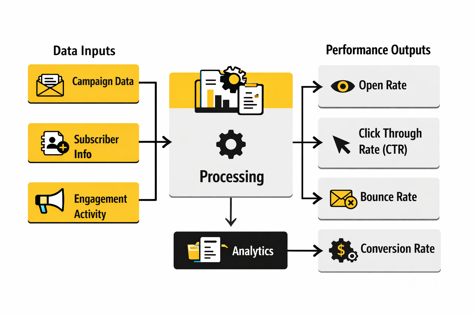
The cleanest way to read performance is to split the data into four layers: delivery, attention, action, and outcome. Delivery tells you whether the message reached the inbox at all. Attention tells you whether the preview layer and send context earned a look. Action tells you whether the content and CTA got a response. Outcome tells you whether the click actually produced business value.
That structure matters because each layer points to a different fix. Google’s Postmaster documentation and sender guidelines focus on spam rate, reputation, authentication, and delivery errors because you cannot optimize creative on mail that never really lands. Mailchimp’s reporting guidance treats bounces as a list-health issue, and Klaviyo’s deliverability monitoring guidance says high or rising bounce rates usually point to list hygiene or sender reputation problems. So if delivery is weak, the mockup is not the first thing to blame. Google Podpora+3
Attention is where subject line, sender identity, timing, and inbox placement show up, but it is the layer you should read most carefully. Mailchimp’s benchmark data still makes open rate useful as a directional signal, yet Mailchimp’s MPP guidance and Litmus’s Apple privacy resources both warn that Apple privacy behavior inflates or distorts open-based reporting. That means a mockup with a strong preview strip may still deserve credit for better opens, but you should not treat open rate as final proof that the email worked. Mailchimp+2
Action is where the mockup starts getting judged on its actual content. Mailchimp’s definition of click rate makes it a useful measure of how many delivered emails led to interaction, while Campaign Monitor’s reporting guide describes CTOR as a leading indicator of how compelling the content was after the open. That is why a high-open, low-click email usually points to a content problem, not an inbox problem. The promise got the open, but the body did not cash it in. Mailchimp+2
Outcome is the layer too many teams ignore because it is harder to wire up. But it is the layer that matters most. Klaviyo’s 2026 benchmarks show flows generating nearly 41% of total email revenue from just 5.3% of sends, with average revenue per recipient nearly 18 times higher than campaigns and placed order rates about 13 times higher. That is a huge signal: when the email is timely and behavior-based, relevance beats raw volume. So if your mockups keep producing decent click numbers but weak revenue, the action is not always “design a prettier email.” It may be “build more triggered journeys and align the email to a more specific moment.” Klaviyo
If you want that reporting to flow cleanly into the rest of the customer journey, this is where stack choices start to matter. Teams that run nurture and attribution in HighLevel, centralize contact context in Copper, or tighten link-level attribution with Dub usually have a much easier time connecting a mockup decision to actual revenue. The same is true when the email is sending people into a clearly tagged form built with Fillout or a landing path already mapped in Replo.
How to Interpret the Signals Without Fooling Yourself
The most useful way to read data is by pattern, not by isolated percentages. If opens are strong but clicks are weak, the preview layer probably worked and the body needs attention. That usually points back to message hierarchy, offer clarity, or CTA strength in the email marketing mockup, not to deliverability. Mailchimp+1
If clicks are healthy but revenue is weak, the problem is often after the click. The landing page may not match the email promise, the form may create friction, or the offer may lose clarity once the subscriber leaves the inbox. That is exactly why the mockup should be reviewed together with the destination page rather than as a standalone creative. Klaviyo’s benchmark data on revenue per recipient and order rate makes this obvious: the emails that generate business results are not just the ones that get opened, but the ones that complete the journey. Klaviyo
If unsubscribe rate rises, take it seriously even when clicks still look decent. Klaviyo says a great unsubscribe rate is below 0.2%, and both Klaviyo and Mailchimp treat unsubscribes as a signal that the content, frequency, or targeting is out of alignment. That is not just a retention issue. It is an early warning that your future deliverability can get worse if you keep pushing the same pattern. Klaviyo Help Center+2
If spam complaints rise, stop treating the campaign like a creative experiment and start treating it like a deliverability incident. Google says senders should keep user-reported spam below 0.1% and prevent it from reaching 0.3% or higher, while Yahoo’s sender best practices say to keep spam rate below 0.3% and support clear unsubscribes. When those numbers move in the wrong direction, the right action is usually tighter segmentation, faster suppression of disengaged users, and a hard look at whether the email was truly expected. Google Podpora+1
If bounce rate is high, the data is usually talking about acquisition quality and list maintenance, not design. GetResponse’s benchmark report puts the average bounce rate at 2.33%, Mailchimp explains that bounces happen when the message cannot be delivered, and Klaviyo flags rising bounce rates as a sign of list hygiene or sender reputation issues. So the action there is list cleaning, source review, and suppression logic, not another round of tweaking button color in the mockup. getresponse.com+2
The Benchmarks That Actually Change Decisions
The benchmark that matters most depends on the job of the email. For a promotional campaign, click rate and downstream conversion usually matter more than inflated opens. For a welcome flow, you should expect stronger engagement because the message is tied to a fresh moment of intent, and GetResponse’s benchmark data shows triggered emails outperforming newsletters on both open rate and click-through rate. That should push your design decisions toward relevance and timing, not just prettier templates. getresponse.com
For ongoing lifecycle programs, outcome metrics matter even more. Klaviyo’s benchmark report shows flow click rates at 5.58% versus 1.69% for campaigns, and its revenue data makes the same point even louder: behavior-based sends are where email becomes a real revenue system. The action this should drive is obvious. Use your best email marketing mockup work on the sequences that fire at high-intent moments, not only on one-off blasts. Klaviyo
For mission-driven organizations, the right benchmark may not be revenue at all. M+R’s 2025 Benchmarks tracks email-sourced revenue per subscriber and actions per subscriber because those are closer to real organizational outcomes than opens by themselves. That is a useful lesson even outside nonprofits: your core KPI should reflect the reason the email exists, not just the easiest number your ESP puts at the top of the dashboard. M+R Benchmarks 2025
The point of all this is not to drown in reporting. It is to create a cleaner feedback loop for the next version of the mockup. Good data tells you whether to rewrite the subject line, simplify the hero, tighten the CTA, clean the list, segment harder, or fix the page after the click. When you read the numbers that way, analytics stops being a pile of percentages and starts becoming creative direction.
Testing, Approval, and Launch Without Surprises
By this point, the email marketing mockup is no longer just a creative asset. It is a decision system. The teams that get real leverage from it are not the ones that make one beautiful email. They are the ones that turn one good mockup into a repeatable way of building, reviewing, shipping, and improving email without losing their minds every week.
That shift matters because scale changes the job. A mockup that works for one campaign can fall apart when it has to support multiple audiences, more stakeholders, stricter deliverability rules, and faster launch cycles. This is where advanced teams stop asking, “Does it look good?” and start asking, “Can this design survive production pressure, list complexity, and inbox rules without becoming fragile?”
Scale the Mockup Into a System
The cleanest way to scale an email marketing mockup is to stop thinking in one-off templates and start thinking in systems. Litmus recommends a modular design system because reusable content blocks cut production time, improve consistency, and make it easier to keep the email aligned with the rest of the brand. That becomes even more important once multiple people are touching the same program, because inconsistency usually shows up first in email long before anyone admits there is a process problem.
The tradeoff is creative freedom. A looser design approach can feel more expressive in the short term, but it usually creates more QA work, more subjective approvals, and more room for accidental brand drift. A stronger system can feel slightly more constrained at first, but it gives the team something far more valuable: speed without chaos, and variation without reinventing everything every time.
This is also where your tool stack starts to matter in a very practical way. If you are trying to keep campaign logic, automations, and approvals in one place, platforms like HighLevel, Brevo, and Moosend become useful because they reduce the number of places where design, audience logic, and reporting drift apart. The tool is not the strategy, but a scattered stack makes even a strong mockup harder to scale cleanly.
Personalization Needs Restraint, Not More Hype
Advanced email work usually pushes toward more personalization, but that does not mean stuffing every message with more variables. Mailchimp makes a useful distinction between segmentation and personalization: segmentation groups similar people together, while personalization customizes content for the individual. That sounds obvious, but a lot of weak programs blur the two and end up with overcomplicated emails that are technically personalized and strategically unclear.
The better move is to let the email marketing mockup declare which parts of the message stay stable and which parts are allowed to change. Offer framing, CTA hierarchy, and module order often need to remain consistent so the message still feels intentional. Product recommendations, proof blocks, local details, or urgency language can change more safely when the structural logic of the email is already doing its job.
There is also a data-quality risk here that experienced teams respect. Mailchimp’s guidance on unsubscribes ties lower unsubscribe rates to better personalization and segmentation, but that only works when the targeting is actually right. Bad data does not create “slightly less relevant” email. It creates obviously wrong email, and that damages trust faster than generic copy ever will.
If you need cleaner data collection before the send even happens, tightening your forms and preference capture matters as much as tightening the email itself. A structured intake flow in something like Fillout can help keep user choices cleaner before they ever reach your ESP, and a connected CRM like Copper can make it easier to keep the audience logic tied to real customer context instead of scattered fields and hopeful guesses.
Deliverability Is Part of the Design Brief Now
At scale, deliverability stops being a back-end issue and becomes a design constraint. Google’s sender guidelines require easy unsubscribes for all senders and one-click unsubscribe for promotional and subscribed mail sent at volumes above 5,000 messages per day to Gmail users. Yahoo’s sender best practices go further on operating discipline by recommending confirmed opt-in, clear expectation setting, and separating bulk marketing mail from transactional mail by IP or DKIM domain.
That changes how a professional email marketing mockup should be reviewed. The footer is not just legal cleanup anymore. The unsubscribe path, preference language, sender identity, and category expectations are now part of whether the message feels trustworthy enough to keep getting inbox placement over time.
This is one reason preference centers are worth more attention than they usually get. Mailchimp’s preferences center guidance explains that contacts can update profile details, opt in or out of groups, and choose how often they want to hear from you, which can reduce unsubscribe rates. That is a smart tradeoff for growing programs: give subscribers a lighter exit than total opt-out, and you often protect both list quality and future revenue.
There is also a more uncomfortable truth here. Frequency mistakes are usually strategic mistakes wearing a deliverability costume. Yahoo explicitly says to honor the frequency of the list’s intent rather than escalating from weekly or monthly expectations into daily sends, and that principle should absolutely shape how the mockup is used. A great design does not rescue a message that arrives too often, too broadly, or at the wrong moment.
Advanced Inbox Features Are Multipliers, Not Fixes
Once the basics are tight, advanced teams can use inbox-level enhancements to make the email marketing mockup work harder before the open. One path is BIMI, which allows brand-controlled logos to appear in supporting inboxes when the message passes DMARC authentication. That is not just cosmetic. It can reinforce trust right where inbox decisions happen, which is why Oracle’s email trends analysis has called BIMI an increasingly impactful lever for brands. Oracle’s 2025 trends review also notes that enterprises are seeing more value in it as support expands.
Another path is Gmail’s Promotions experience. Google’s developer documentation says senders can annotate promotions with images, deals, expiration dates, and even product carousels so users can interact with those promotions directly from the inbox view. That can be powerful, but Google also warns that visibility depends on quality filters and other limits, so this is not something to treat like guaranteed inventory.
That tradeoff is important. Advanced inbox features can amplify a strong message, but they do not fix a weak one. If the offer is muddy, the segmentation is sloppy, or the CTA logic is weak, adding annotations or a logo next to the sender name will not solve the real problem. Those are multipliers, not substitutes.
Governance Beats Last-Minute Heroics
Most broken launches do not fail because nobody cared. They fail because the process depended on memory, rush, and heroic cleanup at the end. Litmus’s 2025 testing playbook makes the point clearly: QA starts in the framework and design stage, not right before send, and a single email can render in more than 300,000 different ways across clients, devices, and environments. That is exactly why a final sign-off based on a static mockup is never enough.
The advanced version of this is not “test everything forever.” It is deciding what level of rigor the email deserves based on risk. Revenue-critical campaigns, heavily personalized sends, multi-language launches, or anything touching legal or compliance review should get a deeper approval path than a low-risk newsletter module update. Good teams do not apply the same friction to every send. They apply the right friction to the right send.
This is also where experimentation needs adult supervision. Oracle’s trend analysis says enterprises have been cautious about letting generative AI communicate directly with customers without human oversight, and that caution is justified. AI can absolutely help accelerate ideation, subject line options, or early copy drafts, but the risks Oracle highlights around content accuracy, brand voice, and change management are real. The mockup stage is a smart place to use AI for speed, but a dangerous place to surrender judgment.
Even advanced measurement has tradeoffs here. Oracle describes universal holdout groups as a pure way to measure campaign lift, but also notes the opportunity cost and management overhead that make them harder to sustain at scale. That is a useful reminder that not every sophisticated method is automatically the right one. The best workflow is the one your team can actually run consistently without eroding launch quality.
The final professional habit is simple and easy to overlook: close the loop. Do not let the mockup live in design, the build live in the ESP, the data live in another dashboard, and the lessons live in somebody’s memory. The stronger move is to turn winning decisions into new modules, retire weak ones, and let each launch make the next email marketing mockup sharper than the last. That is how the work compounds instead of resetting every time.
By the time a team reaches that level, the biggest questions are usually no longer about layout. They are about choosing the right versioning rules, how many variants deserve testing, when to simplify, and what details are worth obsessing over versus ignoring. Those are the practical questions that matter most once the fundamentals are already in place.
Where the Mockup Fits in the Bigger Marketing System
The best email marketing mockup does not live alone. It sits inside a chain that starts with list quality and expectation setting, moves through design and QA, and ends with inbox placement, clicks, revenue, unsubscribes, and spam complaints. That is why Google’s sender rules, accessibility standards, privacy-driven measurement limits, and pre-send testing practices all affect how valuable the mockup really is in the field. Google Podpora+4
In practice, the mockup becomes more useful when it is connected to the rest of the journey instead of treated like a standalone design file. That usually means keeping the email aligned with the landing page in Replo, the form path in Fillout, the send layer in HighLevel, Brevo, or Moosend, and the conversion path in ClickFunnels or Systeme.io. The mockup gets even stronger when the surrounding workflow is simple enough that strategy, build, test, and reporting do not lose meaning as the campaign moves forward. Litmus+2
If you want the system around the mockup to stay tight, it also helps to connect supporting tools without overcomplicating the stack. Follow-up and conversational paths can sit in tools like ManyChat, social distribution can flow through Buffer or Flick, research and content workflows can connect through Firecrawl, knowledge capture can route through Chatbase, and appointment or routing layers can live in Cal.com, Wispr Flow, ScaledMail, Anything.link, or Guideless. None of that replaces the mockup itself, but it does make it easier to turn one strong email into a repeatable operating system instead of a one-time win. Litmus+1
Frequently Asked Questions About Email Marketing Mockups
What is an email marketing mockup, really?
An email marketing mockup is the visual and structural blueprint for the email before the final coded version is built and tested. It is where the team decides the inbox promise, message hierarchy, CTA logic, layout, accessibility choices, and handoff notes before those choices harden into production work. A template, by contrast, is the reusable coded asset that gets loaded into the ESP and sent to real subscribers. Litmus+1
How detailed should a mockup be before anyone starts coding?
It should be detailed enough that the builder does not have to guess. That usually means locking the sender name, subject line, preview text, module order, primary CTA, link destinations, mobile stacking behavior, alt text intent, and any Dark Mode or accessibility notes before development begins. The cleaner the handoff, the less likely QA turns into a second design round. Litmus+2
What width should I design for?
The safest default is still a content width around 600 to 640 pixels. Mailchimp says its templates are designed to be no greater than 600 pixels wide to fit most email clients, while Campaign Monitor recommends single-column layouts in the 600 to 640 pixel range because they read well on mobile and fail more gracefully when rendering gets messy. That does not mean every email must look identical, but it does mean wider designs need a very good reason. Mailchimp+2
Should I always design mobile-first?
In most cases, yes. Campaign Monitor recommends planning for mobile behavior during design because narrow, single-column layouts are easier to read and easier to preserve across devices, and Litmus notes that hybrid approaches help when some clients ignore media queries. Mobile-first thinking also forces better hierarchy, which usually improves the desktop version instead of hurting it. Campaign Monitor+1
Do I need a Dark Mode version of the mockup?
You do not always need a completely separate Dark Mode design, but you absolutely need to review how the mockup behaves in Dark Mode. Litmus notes that email clients handle Dark Mode differently, and Mailchimp recommends transparent backgrounds, strong contrast, and solid button fills so the message stays legible across viewing modes. A mockup that ignores Dark Mode is still unfinished for a meaningful share of subscribers. Litmus+2
Can I send an image-heavy email and still be fine?
You can, but it is rarely the smartest default. Mailchimp’s accessibility guidance says not to hide important information in images, Litmus notes that images may be blocked and ALT text may appear instead, and WCAG guidance still favors real text over images of text whenever possible. So if the offer, CTA, or key explanation matters, keep it live and readable instead of trapping it inside a graphic. Mailchimp+2
How many CTAs should one email have?
Most emails work better when one primary CTA clearly dominates. Campaign Monitor treats the CTA as the part of the email most directly tied to the click, and both Campaign Monitor and Klaviyo warn that too many CTAs increase cognitive load and weaken hierarchy. You can still include supporting links when they make sense, but the reader should never have to wonder what the main next step is. Campaign Monitor+3
Do I need a plain-text version?
Yes, or at least a deliberate plain-text fallback. Mailchimp explains that plain-text emails contain only the core content and that many people who use screen readers prefer them, while its design guidance also notes that including a plain-text version helps people on platforms that do not support HTML well. Even when you send HTML first, the plain-text version is part of professional email hygiene. Mailchimp+2
Should every email go through full cross-client QA?
Every email should go through enough QA for its risk level, and critical emails should absolutely get broader cross-client testing. Litmus says QA starts early rather than right before send, and Email on Acid frames pre-deployment review as the last gatekeeper before launch. The higher the stakes, the more dangerous it is to assume the mockup and the live inbox experience will match by default. Litmus+1
Can AI help build email marketing mockups without making them worse?
Yes, but it works best as support, not as autopilot. Litmus says AI in email marketing is moving from experimentation into daily use, and Oracle’s 2025 trends analysis says brands are still cautious about letting generative AI communicate directly with customers without human oversight. The smart use case is speed on drafts, options, and repetitive tasks, with human judgment still controlling message quality, brand voice, and risk. Litmus+1
What should I measure first after launch?
Start with the metrics that tell you whether the email created action, not just whether a tracking pixel fired. Mailchimp says open tracking is not fully accurate, and Apple Mail Privacy Protection can distort open-based reporting, so click rate, downstream conversion, unsubscribe rate, bounce behavior, and spam complaints usually tell you more about whether the mockup actually worked. Opens are still useful as directional context, but they are no longer a trustworthy finish line on their own. Mailchimp+3
Work With Professionals
Explore 10K+ Remote Marketing Contracts on MarkeWork.com
Most marketers spend too much time chasing clients, competing on crowded platforms, and losing a percentage of every project to middlemen. MarkeWork gives you a better way. Browse thousands of remote marketing contracts and connect directly with companies desperate to hire skilled marketers like you, without platform commissions and without unnecessary gatekeepers.
If you're serious about finding better opportunities and keeping 100% of what you earn, explore available contracts and create a profile for free at MarkeWork.com.