A sales page does not fail because the button color was wrong. It usually fails because the page never makes the offer feel clear, credible, or urgent enough for a real buyer to act. That matters more than most teams want to admit, especially when the median landing page conversion rate sits around 6.6% across industries and even small improvements can change the economics of paid traffic, email, and organic acquisition.
The first job of a sales page is to answer the visitor’s silent questions fast. People often leave a web page within 10 to 20 seconds unless the value proposition is immediately clear, which is why clever copy usually loses to specific copy. The same pattern shows up in recent large-scale conversion data, where simpler language outperformed more complex writing, with 5th to 7th grade readability converting better than professional-level copy.
That urgency gets even sharper on mobile. Research summarized by Google and Deloitte found that a 0.1 second speed improvement was associated with conversion gains of about 8% for retail and 10% for travel, which tells you something important about how to write sales pages that convert: great copy still needs a low-friction experience. And because trust now carries even more weight in digital buying, with 61% of customers saying AI advances make trust more important and 64% believing companies are reckless with customer data, your page has to feel transparent as well as persuasive.
A high-converting sales page is really a sequence of decisions. You lead with relevance, build desire with specifics, reduce resistance with proof, and make the next step feel obvious. If you are building as you write, platforms like ClickFunnels, Systeme.io, or Fillout can help you move from draft to live test quickly, but the page structure still does the real conversion work.
Article Outline
- Why Sales Pages Convert or Fail
- The Conversion Framework Behind Strong Sales Pages
- How to Write the Opening Section and Value Proposition
- How to Build Trust, Desire, and Objection Handling
- How to Design the Call to Action and Page Experience
- How to Test, Improve, and Scale What Works
Why Sales Pages Convert or Fail
A sales page works when it reduces uncertainty at every scroll depth. Visitors need to understand what the offer is, who it is for, why it is different, and what happens next without having to piece the story together themselves. That is also why pages with less friction tend to win: Baymard’s research found that the number of form fields affects usability more than the number of steps, and Nielsen Norman Group has shown that clear pricing and upfront disclosure increase trust while design quality and transparency remain core credibility signals.
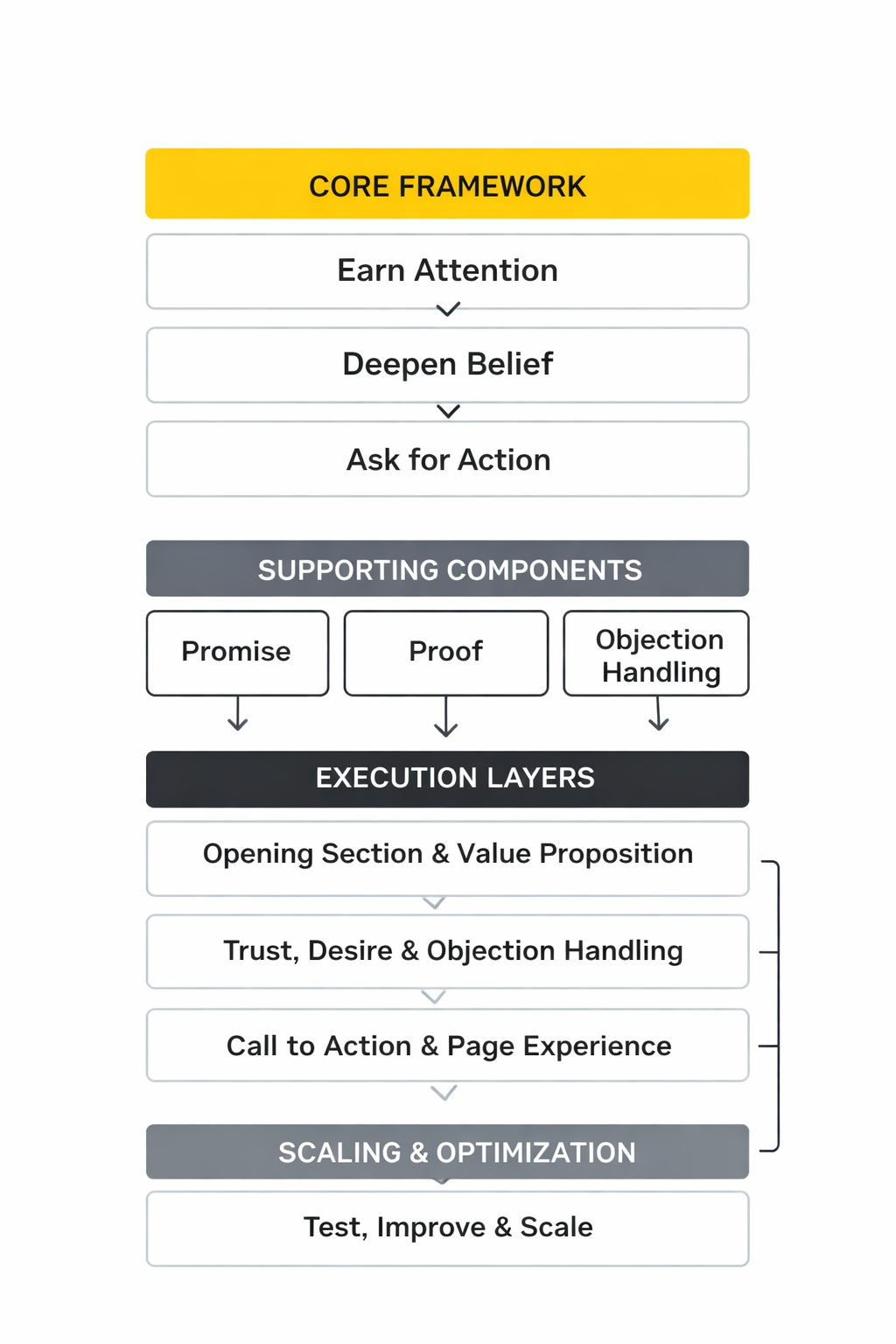
The Conversion Framework Behind Strong Sales Pages
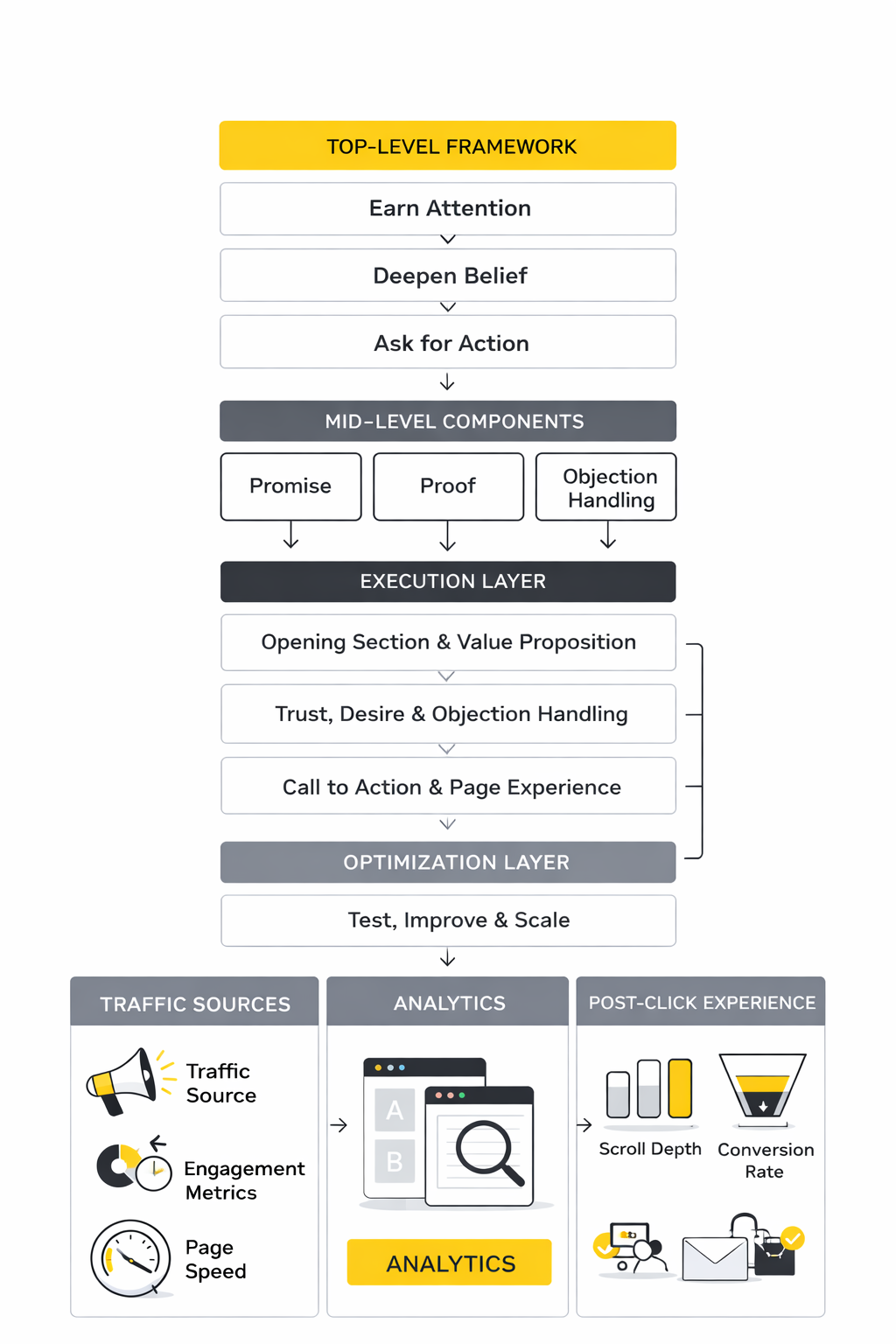
The framework for this article is simple on purpose. First, the page earns attention with a sharp promise. Then it deepens belief with proof, specificity, and objection handling before asking for action in a way that feels natural instead of premature.
That structure fits how people actually evaluate offers online. Nielsen Norman Group’s homepage research emphasizes clarity and goal guidance, and Baymard’s checkout benchmark shows that friction and weak UX directly cost sales. So throughout the next sections, we will build the page the same way a buyer experiences it: from first impression to final click.
How to Write the Opening Section and Value Proposition
If you want to learn how to write a sales page that converts, start with the top of the page because that is where attention is either won or lost. Your visitor is not looking for a clever warm-up. They are trying to answer a brutally practical question: is this for me, and is it worth my time?
That is why the opening section has to do more than sound polished. It needs to create an immediate match between the reader’s problem, the promise of the offer, and the next step they should take. Google’s own guidance on matching ads and landing pages makes the point clearly, and usability research keeps landing in the same place: pages work better when the value proposition is obvious fast, descriptive, and easy to scan, especially in the first words a person sees on screen through headline clarity and strong hero messaging.
Lead With a Promise, Not a Description
Most weak sales pages open by describing the product category instead of making a meaningful promise. “We help businesses grow” sounds safe, but it does nothing for a buyer who wants a specific result, a specific pain solved, or a specific outcome made easier. A better opening draws a straight line between the reader’s current frustration and the change your offer can create.
This is where people often overcomplicate things. A headline does not need to be poetic. It needs to answer what the offer is, who it helps, and what makes it worth continuing to read, which is exactly why clear value propositions in the hero section keep outperforming vague branding language.
When you write your promise, force yourself to remove every phrase that could fit ten other companies. Specificity is not decoration here. It is the mechanism that makes the reader think, “finally, this page gets what I want.”
Write a Headline That Carries the Page
A strong headline is not the whole sales page, but it sets the direction for everything after it. The easiest way to write one is to combine the outcome, audience, and differentiator in a single thought. That immediately gives the reader context without making them work for it.
This matters because web users scan before they commit to reading, and the first few words of a heading carry disproportionate weight. So do not bury the outcome behind branding language, a metaphor, or a long setup. Put the most important idea first, then let the rest of the page prove it.
A useful test is simple: if someone only reads the headline and nothing else, would they still understand the core offer? If the answer is no, the headline is still doing too little. When you are writing a sales page that converts, vague headlines are expensive because they force the rest of the page to rescue weak positioning.
Use the Subheadline to Add Stakes and Clarity
The subheadline should not repeat the headline in softer words. Its job is to sharpen the promise, add context, and lower confusion. This is often the best place to explain how the offer works, who it is best for, or what common alternative it improves on.
Think of it as the bridge between attention and belief. The headline creates interest, then the subheadline turns that interest into enough clarity for the reader to keep moving. That is one reason modern landing page guidance keeps emphasizing concise hero copy, message hierarchy, and scannability in the opening section through clear supporting text and accessible readability.
There is also a practical readability issue here. Unbounce’s large-scale benchmark work found that simpler reading levels correlated with better performance in many cases, which is exactly why your subheadline should sound like a smart human explaining the offer, not a legal disclaimer dressed up as marketing. Clarity is persuasive because it lowers mental effort.
Make the First Screen Do Four Jobs
The first screen of a sales page has to work harder than most marketers realize. It needs to confirm relevance, present the core outcome, establish a minimum level of trust, and show the next step. If any one of those is missing, the reader has to hunt for it, and that hunt creates drop-off.
In practice, that means your above-the-fold section usually needs a clear headline, a supporting subheadline, one primary call to action, and at least one trust cue. That trust cue could be a concrete result, a recognizable client category, a meaningful guarantee, or a short proof point, but it has to support the promise rather than distract from it. This matches how scannable web content and message-matched landing pages reduce friction before the deeper persuasion elements take over.
This is also where mobile reality matters. Unbounce reports that 83% of landing page visits happen on mobile, so your opening section cannot depend on tiny proof text, overstuffed layouts, or a CTA buried under decorative elements. If the first screen collapses on mobile, the copy may never get a chance to do its job.
Focus on One Reader and One Dominant Desire
A sales page gets weaker every time it tries to speak to three different buyers at once. The opening section should feel like it was written for one clear type of person with one main problem and one desired outcome. That does not mean the offer has to be narrow. It means the message has to be.
This is where many pages lose conversions without realizing it. They stack extra audiences, extra use cases, and extra promises into the hero because they are afraid of excluding someone. What actually happens is the opposite. The page becomes harder to recognize, less believable, and less emotionally sharp because no one feels directly addressed.
A clean opening usually wins because it creates instant self-identification. The reader thinks, “this is for someone like me,” and that thought is what earns the next scroll. When you are figuring out how to write a sales page that converts, this is one of the biggest upgrades you can make without changing the offer itself.
Turn Features Into Immediate Buyer Meaning
Readers do not buy because a feature exists. They buy because they understand what that feature changes for them. So in the opening section, avoid listing mechanics before you translate them into buyer meaning.
For example, “AI-powered workflow builder” is not yet persuasive on its own. It becomes more persuasive when the page explains the practical payoff, such as faster launch speed, fewer manual steps, or less dependence on technical help. Good conversion copy closes that gap fast because readers naturally care more about consequences than components.
This is also why the strongest value propositions explain both usefulness and distinction. CXL’s guidance on creating a strong unique value proposition centers on clarity around benefits, problem-solving, and difference, not just product description. Your reader should know not only what the offer does, but why that matters right now.
Keep the Opening Honest Enough to Build Trust
Overpromising is one of the fastest ways to damage a sales page, especially in crowded markets where buyers have seen every miracle claim already. Big language can attract clicks, but weakly supported claims kill trust once the reader starts looking for proof. That is why the best opening sections feel confident without sounding inflated.
A practical way to do this is to tighten the claim until you can support it. If you say the offer is faster, explain faster than what. If you say it is easier, explain what friction it removes. If you say it gets better results, the page needs to define results in a way the reader can actually evaluate.
Trust is now a bigger conversion lever than many brands acknowledge. Recent customer research from Salesforce shows trust has become more important as technology changes faster, which means the opening section cannot rely on hype and hope. It has to sound like someone who understands the stakes and can back up what they are saying.
Draft the Hero Section Before You Write the Rest
A lot of people write hero copy last because it feels important. In practice, drafting it early is often smarter because it forces strategic clarity before you build the rest of the page. Once you know the promise, audience, tension, and next step, the rest of the page becomes easier to structure.
This does not mean the first draft has to be final. It means the hero becomes your working compass. Every later section can then support the promise instead of drifting into random proof, disconnected benefits, or objections that do not match the main buyer.
If you are building while you write, tools like ClickFunnels or Systeme.io can help you mock up and test hero sections quickly. But the real win is not the software. It is getting the opening message clear enough that the rest of the sales page has something strong to defend.
How to Build Trust, Desire, and Objection Handling
Once the opening section has done its job, the page moves into a different kind of persuasion. Now the reader is interested, but interest alone does not convert. They need reasons to believe, reasons to want, and reasons to stop hesitating.
This middle part of the page is where many sales pages become either too defensive or too generic. They dump testimonials, features, and guarantee language onto the page without a clear sequence. A better approach is to build belief first, deepen desire second, and handle resistance before the CTA asks for a serious commitment.
Build Belief Before You Ask for the Sale
After the opening section creates interest, the next challenge is belief. Readers rarely buy just because the promise sounds good. They buy when the page makes the outcome feel credible, achievable, and relevant to their situation.
Trust signals play a measurable role here. Research on digital trust shows design quality, transparent messaging, and evidence of legitimacy all influence whether users believe what they are reading through signals like clear credibility indicators and professional design. When those signals are missing, even a strong offer can feel risky.
So this section of the sales page should answer one simple question: why should the reader believe this will work?
Use Specific Proof Instead of Vague Claims
Generic claims rarely move buyers forward. Words like “powerful,” “best,” or “innovative” create noise because they can apply to almost anything. Proof works when it replaces general language with something concrete and observable.
Strong proof elements usually include:
- Clear results or outcomes tied to the offer
- Real use cases that show how the product fits into a workflow
- Recognizable customer categories or industries
- Transparent explanations of how the solution works
These details reduce uncertainty. Research into online trust consistently shows that users respond better to transparency and concrete information than to abstract promises, especially in purchase decisions involving new products or unfamiliar brands.
That is why good sales pages do not just say something works. They show how and why it works.
Show the Mechanism Behind the Result
Belief grows when readers understand the mechanism behind the promise. If the page only states outcomes, the offer can feel exaggerated or unrealistic. But when the mechanism becomes clear, the result starts to feel plausible.
For example, instead of saying a tool helps teams move faster, explain the exact mechanism that produces that speed. It could be automation, templates, or a simplified workflow that removes manual steps. Once the reader understands the cause, the result becomes easier to trust.
This pattern shows up across high-performing product pages. Buyers want to understand how the tool actually fits into their workflow, especially in SaaS environments where onboarding friction can quickly reduce adoption. Clear explanations reduce that hesitation.
Build Desire With Outcome-Focused Benefits
Once the reader believes the offer works, the next step is to deepen desire. This is where the page connects the product’s capability to the reader’s personal or business outcome.
Desire grows when the reader sees a meaningful improvement to something they care about. That could be speed, revenue, efficiency, reputation, or simplicity. The key is that the benefit must connect directly to the reader’s daily reality.
Strong benefit sections often highlight outcomes like:
- Less time spent on repetitive work
- Faster launches or execution
- Reduced complexity in existing systems
- Clearer results from existing marketing efforts
Pages that focus on outcomes instead of feature lists usually perform better because they connect with the reader’s motivation rather than the product’s architecture. Buyers care about the change they will experience after the purchase, not just the features they receive.
Address the Real Objections Early
Every serious buyer has objections. Some worry about price. Others worry about complexity, time commitment, compatibility, or reliability. If the sales page ignores those concerns, the reader starts building arguments against the offer.
The most effective pages bring those concerns into the open and answer them directly. That approach removes tension and replaces uncertainty with clarity.
Common objections a sales page should address include:
- Will this actually work for my situation?
- How difficult is it to implement?
- Is the investment justified by the outcome?
- What happens if it does not work for me?
Handling objections in the middle of the page prevents readers from silently exiting while still undecided. It also signals confidence, because transparent businesses are willing to discuss limitations and expectations openly.
Structure the Middle of the Page Around Logical Momentum
The middle section of a sales page should feel like a progression rather than a random set of marketing elements. Each block should make the next one easier to accept.
A practical sequence often looks like this:
- Proof that the promise is realistic
- Explanation of the mechanism behind the result
- Benefits connected to the reader’s real goals
- Answers to likely objections
When that order is respected, the page gradually moves the reader from curiosity to confidence. That shift matters because online purchases are fundamentally trust decisions.
Tools used to build modern sales pages often make it easy to structure these sections quickly. Platforms such as ClickFunnels and Systeme.io allow teams to build modular sections for proof, benefits, and testimonials so the persuasion flow remains organized instead of scattered.
But even with the right tools, the strategy still matters. The page must move the reader from interest to confidence before asking for a decision.
How to Design the Call to Action and Page Experience
At some point the reader is ready to decide. The final section of a sales page must make that decision feel simple, logical, and low risk.
Many sales pages fail here because the call to action is treated as a button rather than a process. In reality, the call to action represents the final step in the entire persuasion sequence. If the page has done its job correctly, the CTA should feel like a natural continuation rather than a sudden demand.
Make the Next Step Obvious
The reader should never wonder what happens next. A strong CTA clearly explains the action and the outcome of that action.
Examples include:
- Start the free trial
- Create your account
- Get instant access
- Schedule a demo
Clear calls to action reduce friction because they remove uncertainty. Nielsen Norman Group research into usability repeatedly shows that users perform tasks faster and with fewer errors when interfaces present clear actions and predictable outcomes through visible system status and clear user guidance.
The same principle applies to sales pages. If the next step is obvious, more people take it.
Reduce Friction Around the Decision
Friction can appear in surprising places. Long forms, unclear pricing, confusing navigation, or slow loading pages all increase the chance that a visitor abandons the purchase process.
Ecommerce and checkout studies show how sensitive conversion rates are to these issues. Large-scale checkout usability research has repeatedly demonstrated that unnecessary complexity reduces completion rates and increases abandonment across many industries through checkout usability benchmarks.
This is why high-performing sales pages simplify the final step as much as possible. They reduce required fields, clarify pricing, and keep the path to completion direct.
Turn the CTA Into a Short Process
Instead of thinking about the CTA as one button, treat it as a short process that guides the reader through the last decision. This is where implementation details become tangible.
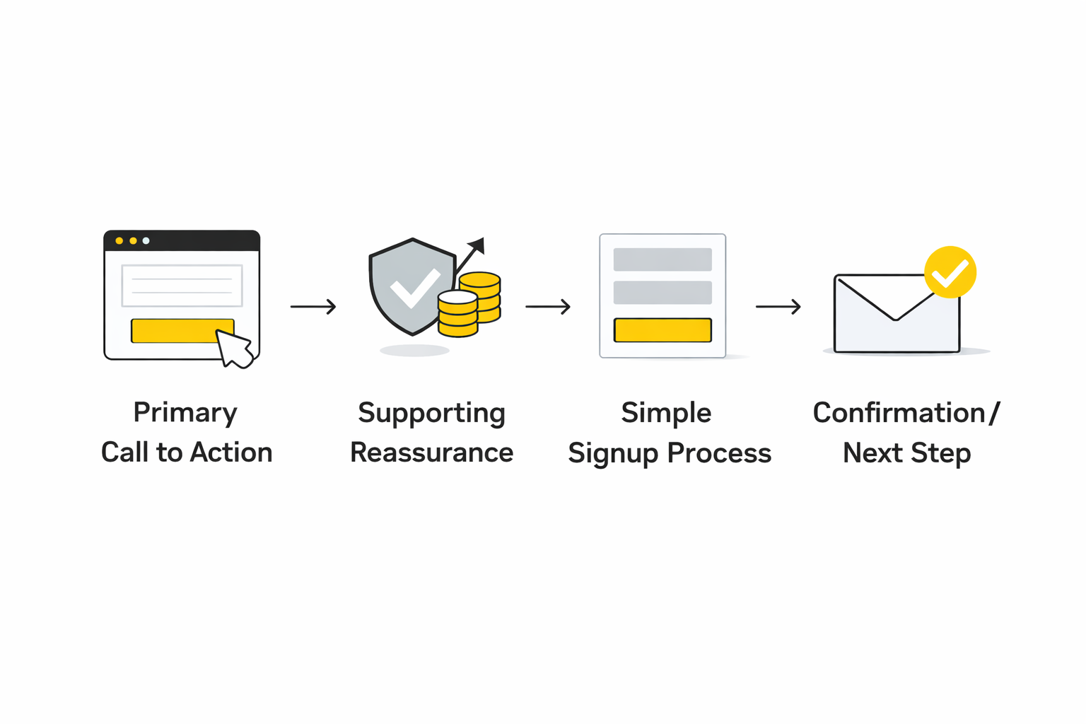
A practical CTA implementation flow often looks like this:
- Primary CTA button that repeats the promise or next step
- Supporting reassurance such as guarantees, refund policies, or onboarding support
- Simple form or signup process that collects only essential information
- Immediate confirmation or onboarding step that reinforces the decision
This structure works because it continues the trust-building pattern established earlier in the page. The CTA does not suddenly introduce pressure or confusion. Instead, it reinforces the reader’s confidence that moving forward is the logical next step.
Use Reinforcement Near the Decision Point
Even when a reader reaches the CTA, hesitation can still appear. This is where reinforcement elements help close the final gap between interest and action.
Common reinforcement elements include:
- Short testimonials placed near the CTA
- Quick reminders of the main benefit
- Risk reduction through guarantees or trials
- Transparent pricing explanations
These elements are effective because they support the reader’s decision at the moment it matters most. Instead of forcing the visitor to scroll back up to remember why the offer matters, the page reminds them right where the decision happens.
Make Implementation Simple for the Team
A final consideration in learning how to write a sales page that converts is operational. Even the best copy loses value if the team cannot launch or iterate quickly.
Modern funnel builders and marketing platforms exist largely to solve this problem. Tools like Moosend for email automation or Brevo for customer communication allow teams to connect sales pages with onboarding, follow-up sequences, and lifecycle messaging without complicated technical setups.
This integration matters because conversion does not end when someone clicks the CTA. The post-click experience—confirmation, onboarding, and follow-up—determines whether the purchase becomes a long-term customer relationship.
When the page structure, CTA design, and implementation tools all align, the sales page becomes more than a marketing asset. It becomes a reliable system for turning attention into action.
What the Data Says About Sales Page Performance
Once the page structure is built and the call to action is clear, the next question becomes measurable: is the page actually converting? Understanding how to write a sales page that converts requires more than intuition. It requires reading the signals that show whether the page is doing its job.
The challenge is that conversion metrics rarely tell a simple story. A sales page might attract thousands of visitors but still struggle to turn attention into action. Or it might convert well but fail to generate enough traffic to matter. The numbers only become useful when they are interpreted in context.
What Typical Conversion Benchmarks Really Mean
Conversion benchmarks are helpful only when used as directional guidance rather than rigid expectations. Large landing page datasets consistently show that the median conversion rate across industries sits near 6–7%, while top-performing pages can reach significantly higher depending on traffic quality and offer clarity through research summarized in the Unbounce Conversion Benchmark Report.
This does not mean every sales page should aim for a single universal number. A page selling a low-cost digital product will usually convert differently than one selling a complex B2B service. Price, traffic intent, and audience familiarity all influence the final percentage.
What benchmarks actually do is help diagnose problems. If a page converts far below common industry ranges, the issue is rarely the button color or layout detail. It is usually one of three deeper problems:
- The offer is unclear or poorly positioned
- The page fails to build enough trust
- The call to action creates friction
Understanding that distinction prevents teams from optimizing the wrong things.
Why Engagement Metrics Matter Before Conversions
Conversion rates alone rarely explain what is happening inside a sales page. Engagement signals often reveal problems earlier in the funnel.
For example, research into web behavior shows that users often leave a page quickly if the value proposition is not clear within the first seconds of reading through studies on how long users stay on web pages. When bounce rates are high or average time on page is extremely short, the issue is often the opening message rather than the CTA.
Several engagement indicators are especially useful:
- Scroll depth shows whether readers move through the page
- Time on page indicates how much attention the content holds
- Click distribution reveals where readers interact with the page
These signals help identify which section of the sales page is weakening the persuasion sequence.
Understand the Mobile Reality of Modern Sales Pages
Any discussion about sales page performance has to acknowledge how people actually access these pages. Mobile traffic now dominates many industries, and this shift directly affects conversion behavior.
Landing page research shows that over 80% of visits often occur on mobile devices, which dramatically changes how users scan, read, and interact with content through observations summarized in landing page best practice research.
That matters because long blocks of text, slow page speed, and cluttered layouts are amplified on smaller screens. A sales page that feels smooth on desktop can feel exhausting on a phone.
When conversion rates lag despite strong messaging, mobile usability often explains the gap.
Page Speed and Its Direct Impact on Conversions
Speed is one of the most overlooked conversion factors in sales page design. Even a small delay can affect how many visitors stay long enough to consider the offer.
Performance research exploring page load times found that improvements of just one tenth of a second correlated with measurable increases in conversion rates in retail and travel environments through findings summarized in Milliseconds Make Millions.
The reason is simple. A delay interrupts the moment of attention. When a visitor arrives with curiosity and the page responds slowly, the initial motivation fades quickly.
Speed optimization therefore becomes part of conversion strategy rather than just technical maintenance.
Build an Analytics System That Mirrors the Sales Page
To improve conversion performance consistently, measurement needs to reflect the actual structure of the page. Instead of tracking only the final purchase event, the analytics setup should track the reader’s progress through the persuasion flow.
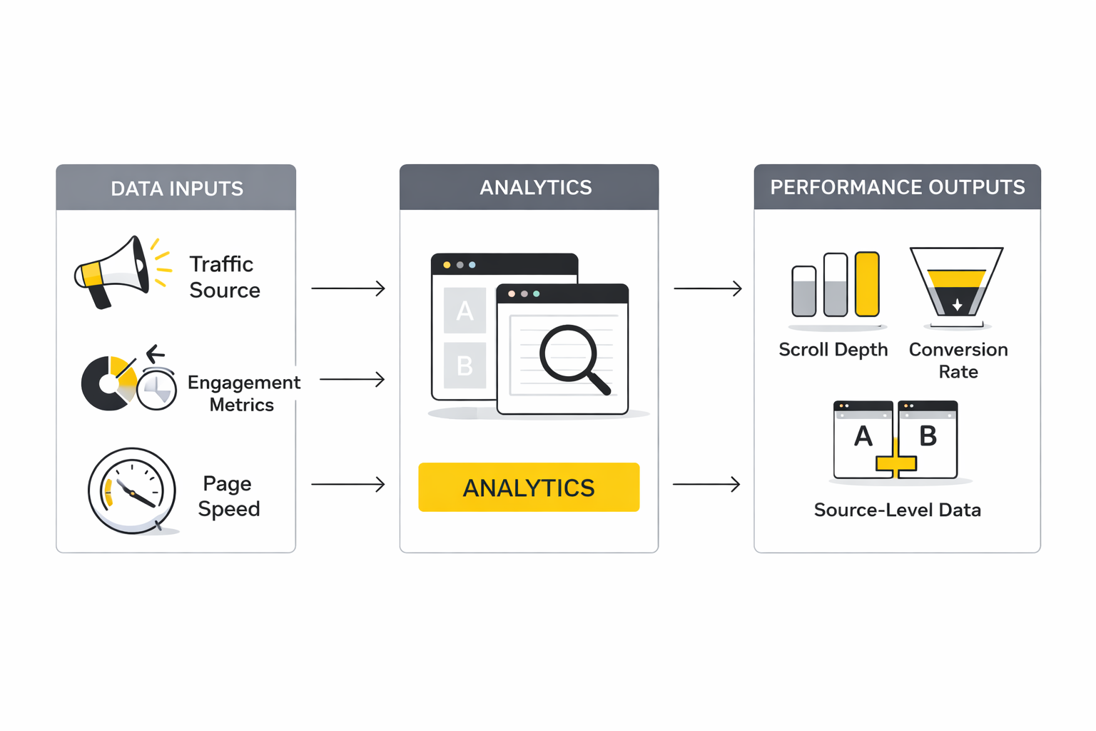
A simple analytics framework might track events such as:
- Landing page visit
- Scroll past the hero section
- Engagement with proof or benefit sections
- Interaction with the CTA
- Completion of signup or purchase
This layered view shows where attention breaks down. If most visitors never reach the benefit section, the opening message may need stronger positioning. If readers reach the CTA but hesitate there, the problem may be friction in the signup process.
Tools designed for marketing automation often integrate with analytics platforms to make this measurement easier. Platforms such as ClickFunnels or CRM tools like Copper allow teams to track visitor behavior from the sales page through the entire conversion path.
Interpret Data as Signals, Not Absolute Truth
Numbers are powerful, but they can also mislead when taken too literally. Conversion data reflects behavior from a specific audience under specific conditions. A change in traffic source, offer positioning, or pricing can shift results dramatically.
That is why experienced marketers treat analytics as signals rather than verdicts. A single experiment rarely proves anything. Patterns across multiple tests reveal what actually works.
When the data shows that visitors consistently engage with the page but hesitate at the final step, the problem may not be persuasion. It may be complexity in the signup flow or uncertainty about pricing.
Understanding that distinction is essential when learning how to write a sales page that converts. Copy and design matter, but performance data reveals which part of the system truly needs improvement.
How to Test, Improve, and Scale What Works
At this stage, the sales page is live, the analytics are in place, and the obvious friction points are visible. Now the work becomes more strategic. Learning how to write a sales page that converts at a higher level means understanding that good pages are not finished when they launch. They improve through disciplined testing, cleaner segmentation, and better alignment between traffic source, message, and offer.
This is also where many teams make expensive mistakes. They change too many things at once, misread early data, or scale traffic before the page has earned the right to handle it. A sales page that performs well at small volume can break fast when more traffic, colder audiences, or a different acquisition channel hits it.
Test One Meaningful Variable at a Time
A/B testing only helps when the test is clean enough to teach you something useful. If you change the headline, proof section, CTA copy, and layout at the same time, you may get movement in the numbers, but you will not know what caused it. That is why practical testing guidance keeps coming back to the same principle: isolate a meaningful variable and measure its effect clearly through recommendations like testing one element at a time and focusing each A/B test on a single change.
The word meaningful matters here. Testing two nearly identical button shades is usually weak unless you already know the rest of the page is highly optimized and you are operating at serious scale. Stronger early tests involve variables that shape buyer interpretation, such as the headline promise, CTA wording, pricing presentation, order of proof, or how objections are handled.
This is where discipline beats creativity. The goal is not to run more tests. The goal is to run tests that create clearer decisions.
Stop Treating Early Wins as Proof
One of the easiest ways to damage a good conversion program is to declare victory too early. A sales page can look like it is improving after a few days simply because the sample is small, the traffic mix shifted, or one campaign temporarily sent warmer visitors. That is not insight. That is noise wearing a suit.
Practical guidance for landing page testing warns against calling results too early and recommends waiting until the data is substantial enough to support a decision, often with at least around 1,000 visitors before making a call. That threshold is not universal, but the principle is solid: do not make structural decisions from tiny samples.
The bigger point is strategic. When you are figuring out how to write a sales page that converts, patience is not passive. It is part of the method. Fast decisions feel efficient, but bad conclusions create months of wasted iteration.
Segment Performance by Traffic Source
A sales page does not perform the same way for every visitor. Someone arriving from a branded email click is not behaving like someone who just saw a cold paid ad. Someone searching for a solution already knows what they want. Someone scrolling social media usually does not.
This is why conversion analysis gets much sharper when you separate performance by source, campaign, and intent. Google Analytics treats conversions as key actions tied to events across channels, which is useful because it allows teams to compare how different traffic sources contribute to results through conversion event tracking in Google Analytics and more granular metrics like session conversion rate.
In practice, this changes what you optimize. If email traffic converts and paid social traffic does not, the problem may not be the sales page itself. It may be a message mismatch between the ad promise and the page promise. That distinction is massive.
Match the Page to the Traffic Temperature
Cold traffic needs more explanation, more trust, and more context. Warm traffic often needs less persuasion and less clutter. Treating those audiences the same is one of the most common scaling mistakes.
This matters even more on fast-scroll platforms. TikTok’s landing page guidance stresses visible business information, accurate offer details, and pages that clearly match what the ad promised through its landing page best practices. In practical terms, that means a TikTok visitor should not click on a hook-driven ad and land on a page that suddenly sounds corporate, vague, or unrelated.
The best move is usually not to force one page to do everything. It is to adapt the opening, proof sequence, and CTA framing to the intent behind the click. That is how you scale without diluting relevance.
Use Behavioral Analytics to See What Standard Reports Miss
Traditional analytics tell you what happened. Behavioral tools help you understand why it happened. That difference becomes extremely valuable once the easy optimizations are done.
Tools like Microsoft Clarity are built for exactly this layer of analysis, using heatmaps and session recordings to show how users click, scroll, hesitate, and abandon a page. Clarity’s own documentation explains that session recordings can reveal what visitors engage with and where improvements are needed through recordings overview.
That kind of visibility matters because sales pages often fail in subtle ways. A section may technically be present but visually ignored. A CTA may be clicked, then abandoned because the next step feels heavier than expected. Standard reports will show a drop. Behavioral analytics will often show the reason.
Scale the System, Not Just the Page
A sales page that converts is valuable. A sales page connected to a working acquisition and follow-up system is far more valuable. Once the page starts performing, the next challenge is protecting that performance while volume increases.
That means looking beyond the page itself. If more paid traffic comes in, the CRM has to capture leads cleanly, the email flow has to follow up quickly, and the onboarding path has to reinforce the promise the page made. Otherwise, the business creates a leak right after the conversion event. Tools like Brevo for lifecycle communication or Copper for sales pipeline visibility can help teams operationalize that post-click flow without losing context between marketing and sales.
This is also where content distribution and creative feedback loops start to matter more. If you are promoting offers through social content, using systems like Buffer or Flick can make it easier to keep testing hooks, angles, and audience response without letting your promotion process become chaotic. The sales page does not exist in isolation. It is part of a larger conversion engine.
Know the Tradeoff Between More Persuasion and More Friction
A longer sales page is not automatically better, and a shorter one is not automatically cleaner. The right length depends on what the buyer needs to believe before acting. Expensive, unfamiliar, or higher-risk offers often need more explanation. Familiar, low-friction offers can convert with less copy.
The tradeoff is simple but important. Every extra section creates another chance to persuade, but it also creates another chance to distract, fatigue, or delay action. That is why the decision should be based on buyer resistance, not on someone’s personal preference for short-form or long-form copy.
This is where benchmarks help less than judgment. Median conversion rates and engagement norms are useful context, but they cannot tell you how much proof your specific audience needs. Only testing, segmented analysis, and real buyer behavior can do that.
Protect the Offer as You Optimize the Page
Sometimes teams keep optimizing the page because it feels more manageable than confronting a weaker offer. But a sales page cannot permanently rescue poor product-market fit, weak pricing logic, or an offer that is hard to understand. It can only express the offer more clearly.
That is why serious optimization always includes offer-level questions. Is the pricing structure helping or hurting clarity? Is the guarantee reducing fear or creating suspicion? Is the promise strong enough to earn attention in a crowded market? These are not copy tweaks. They are business decisions with conversion consequences.
This is the expert-level shift. Instead of asking, “How do we make this page convert better?” you start asking, “What is the page revealing about the strength of the offer itself?” That question is harder, but it is usually where the biggest gains live.
Build a Testing Rhythm You Can Sustain
The most effective teams do not chase random experiments. They build a repeatable rhythm. They review performance, identify the highest-friction point, form a hypothesis, launch one focused test, and document what they learned.
A practical rhythm usually looks like this:
- Review source-level and page-level conversion data
- Watch behavioral sessions for friction patterns
- Choose one high-impact hypothesis
- Test a single meaningful change
- Keep the winner only if the signal holds over time
That process is not flashy, but it compounds. Over time, it creates a much deeper understanding of how buyers respond to the offer, which messages pull attention, which proof builds belief, and which objections still block the sale.
That is the real endgame. When you learn how to write a sales page that converts, you are not just writing one good page. You are building a system that gets smarter every time it runs.
By this point, the picture should be clear. A sales page converts when the message is relevant, the proof is believable, the friction is low, and the follow-through is measured well enough to improve over time. The page is not a block of copy. It is a working system that connects positioning, trust, user experience, analytics, and the post-click journey.
That systems view matters because conversion gains rarely come from one magical tweak. They usually come from getting the fundamentals aligned, then tightening the weak points without breaking what already works. When you approach the page that way, you stop chasing tricks and start building a repeatable revenue asset.
FAQ
What is the most important part of a sales page?
The most important part is the opening message because it determines whether the reader keeps going. If the headline, subheadline, and first screen fail to communicate relevance fast, the rest of the page often never gets seen. That matches long-standing usability findings showing that users make quick judgments about whether a page looks useful, credible, and worth further attention through research on how users scan pages and make fast decisions.
How long should a sales page be?
A sales page should be as long as the decision requires and no longer. Lower-risk offers can often convert with less explanation, while higher-priced, more complex, or less familiar offers usually need more proof, more objection handling, and more context before a reader is ready to act. The smarter question is not “short or long,” but “how much information does this buyer need before saying yes?”
Should every sales page have social proof?
In most cases, yes, because buyers want evidence that the offer is real and relevant before they commit. Social proof can take different forms, including testimonials, customer counts, case examples, recognizable client categories, or usage indicators, but it works best when it supports the page’s core promise instead of feeling pasted in. Trust and credibility remain central conversion factors in digital experiences, which is exactly why strong pages reinforce claims with proof instead of asking readers to believe everything on faith through research summarized by Nielsen Norman Group’s trust and credibility work.
Is a video sales letter better than written copy?
Not automatically. Video can increase clarity and emotional engagement when the offer benefits from demonstration, tone, or storytelling, but written copy still matters because many users prefer to scan before committing time to watch. A practical approach is to treat video as support for the page rather than a replacement for a clear headline, structured copy, and visible call to action.
How many calls to action should a sales page include?
A sales page should usually have one primary action repeated in the right places, not a collection of competing next steps. Repetition helps because readers arrive at readiness at different moments, but the message and outcome of the CTA should stay consistent so the page does not split attention. The goal is not more buttons. The goal is less confusion.
What makes a headline convert better?
A better headline usually makes the outcome clearer, the audience more specific, and the value easier to understand at first glance. Headline performance improves when the most important words appear early and when the message sounds concrete rather than broad or self-congratulatory. That fits usability research showing that people scan headings heavily and rely on the first words to decide whether a section deserves attention through guidance on headings, scanning, and readability.
Should I hide the price until later on the page?
Usually not, unless there is a clear strategic reason tied to a more complex sales process. Transparent pricing or at least transparent pricing logic helps reduce uncertainty, while hidden details often create suspicion and unnecessary hesitation. Clear disclosure and visible expectations tend to support trust, especially in high-intent buying situations where readers are actively evaluating whether the offer fits their budget and goals through research on showing pricing information clearly.
How do I know if my sales page is underperforming?
You know it is underperforming when the numbers consistently show weak movement at a specific stage of the page or funnel. That could mean low conversion rate, shallow scroll depth, poor CTA engagement, or strong click-through with weak completion on the next step. Benchmark data can help frame expectations, with Unbounce’s research showing a 6.6% median landing page conversion rate baseline across industries, but what matters most is how your page performs relative to your traffic quality, offer type, and buyer intent.
What should I test first on a weak sales page?
Start with the variables that change buyer interpretation, not minor visual details. In most cases that means testing the headline, offer framing, proof sequence, CTA language, form friction, or pricing presentation before worrying about cosmetic adjustments. When a page is clearly weak, the problem is usually strategic rather than decorative.
Does page speed really affect conversions that much?
Yes, and more than many teams think. Faster loading pages reduce abandonment during the first seconds of attention, which is critical because that is the moment when interest is still fragile. Google and Deloitte highlighted that even a 0.1 second improvement in mobile site speed correlated with meaningful conversion gains, which is why performance should be treated as part of conversion strategy rather than a separate technical chore.
Should I use the same sales page for all traffic sources?
Usually no. Different traffic sources bring different levels of awareness, trust, and urgency, so the same page will not always convert equally well for every audience. Message match matters, and Google’s own guidance emphasizes that landing pages should closely match ads and keywords because that alignment improves user experience and reduces drop-off after the click.
How much form friction is too much?
Too much friction is anything that asks for more effort than the value of the next step appears to justify. Extra fields, unclear requirements, and long forms can all reduce completion, especially when the reader is still early in the buying decision. Baymard’s research found that the number of form fields has a major impact on usability, which is why strong sales pages collect only what is necessary at that stage.
Can AI help write a sales page that converts?
AI can absolutely help with ideation, outlining, first drafts, angle generation, and iteration speed, but it should not replace clear positioning or buyer understanding. The best use of AI is as a multiplier for strategy, not as a substitute for it. If you are building faster workflows around research, drafting, or automation, tools like Wispr Flow, Firecrawl, or Chatbase can support execution, but the page still needs a human-level understanding of the buyer’s real hesitation and desired outcome.
What tools are useful for building and managing sales page systems?
The right tools depend on the business model, but a few categories matter more than most. You need something to build and test the page, something to capture and route leads, and something to manage the follow-up after the click. For many teams that means page builders like ClickFunnels or Systeme.io, forms through Fillout, email or CRM support through Brevo or Copper, and scheduling tools like Cal.com when the conversion path ends in a call rather than an instant checkout.
Work With Professionals
Explore 10K+ Remote Marketing Contracts on MarkeWork.com
Most marketers spend too much time chasing clients, competing on crowded platforms, and losing a percentage of every project to middlemen. MarkeWork gives you a better way. Browse thousands of remote marketing contracts and connect directly with companies desperate to hire skilled marketers like you, without platform commissions and without unnecessary gatekeepers.
If you're serious about finding better opportunities and keeping 100% of what you earn, explore available contracts and create a profile for free at MarkeWork.com.
By this point, the picture should be clear. A sales page converts when the message is relevant, the proof is believable, the friction is low, and the follow-through is measured well enough to improve over time. The page is not a block of copy. It is a working system that connects positioning, trust, user experience, analytics, and the post-click journey.
That systems view matters because conversion gains rarely come from one magical tweak. They usually come from getting the fundamentals aligned, then tightening the weak points without breaking what already works. When you approach the page that way, you stop chasing tricks and start building a repeatable revenue asset.
Work With Professionals
Explore 10K+ Remote Marketing Contracts on MarkeWork.com
Most marketers spend too much time chasing clients, competing on crowded platforms, and losing a percentage of every project to middlemen. MarkeWork gives you a better way. Browse thousands of remote marketing contracts and connect directly with companies desperate to hire skilled marketers like you, without platform commissions and without unnecessary gatekeepers.
If you're serious about finding better opportunities and keeping 100% of what you earn, explore available contracts and create a profile for free at MarkeWork.com.